JMA Attachments
Redesigning the Collection page
Transforming the standard, technical-only ad grid into a compatibility-focused, delivery-transparent system for tech buyers.
- Role
- Product Designer (Solo)
- Timeline
- March 2023 - June 2026
Context & Problem
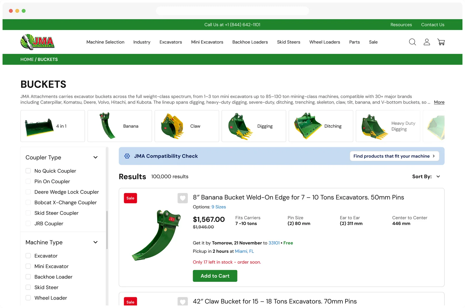
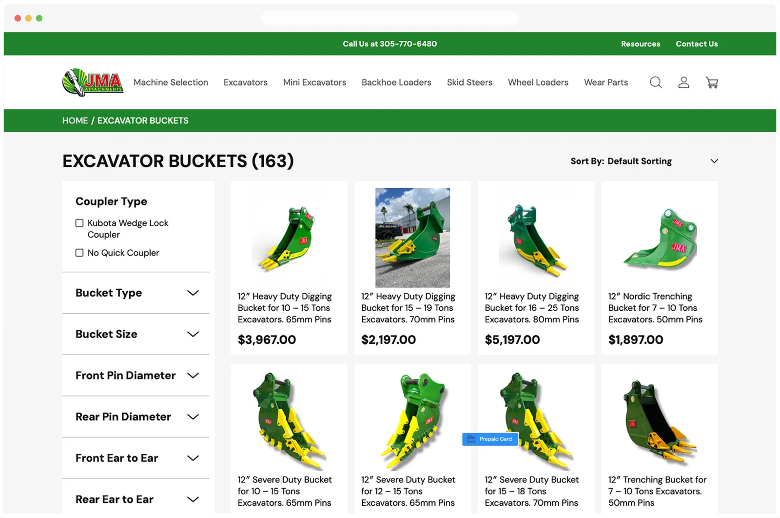
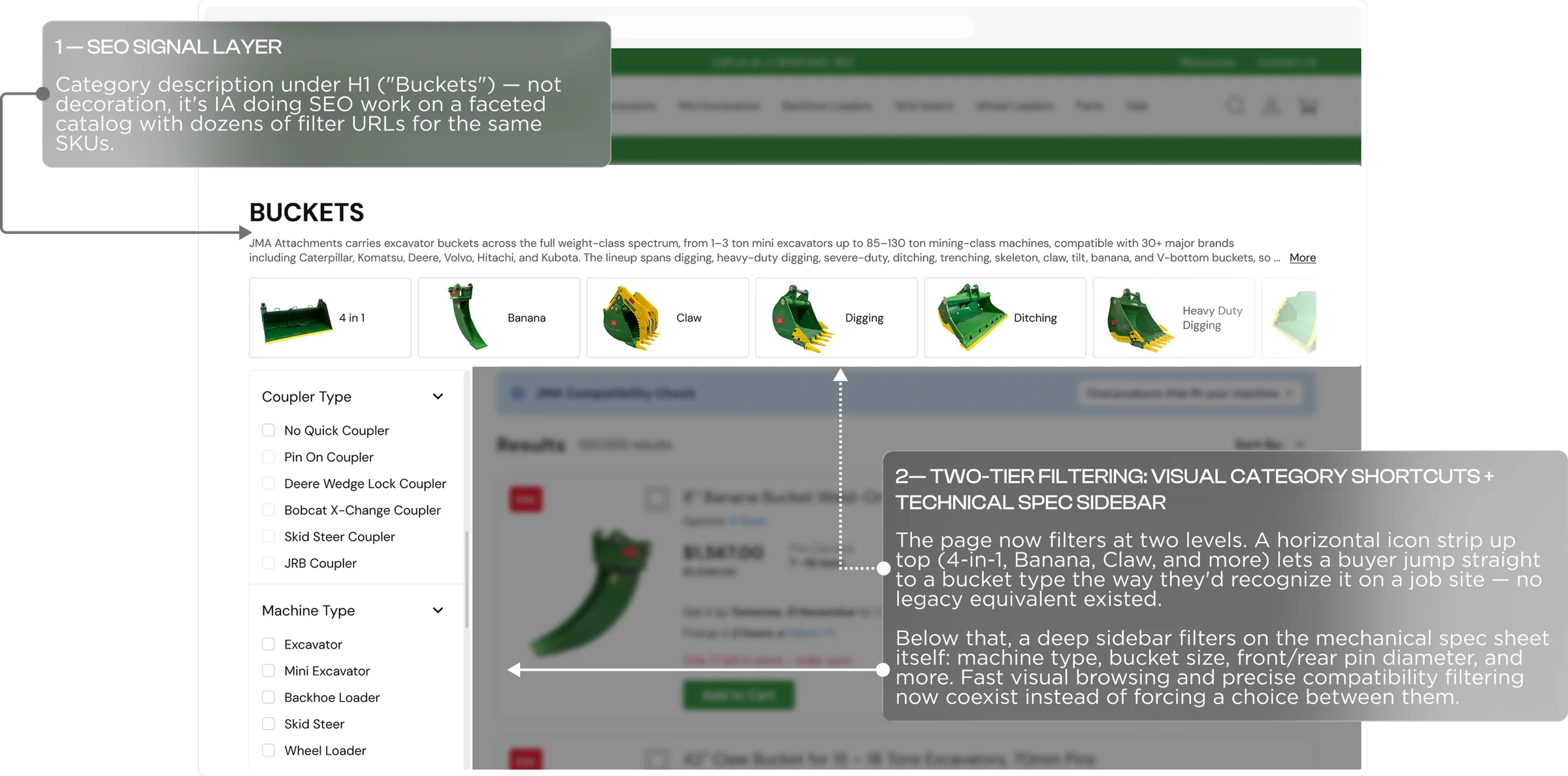
The legacy implementation ran a generic retail merchandising pattern. Beneath that bug sat more structural gaps that compounded it — no faceted filtering against the buyer's actual spec sheet, no way to check machine compatibility before browsing, no visibility into real stock or delivery timing until checkout, and on-page category description copy carried over unedited from an unrelated apparel template.
For a buyer trying to answer does it fit and can I get it in time, the page answered neither — and the recirculation modules meant to build engagement (Similar products, Recommended products, Frequently viewed products) were simply missing.
JMA Attachments
Problem Discovery: Compatibility & Fulfillment
Context & Problem
Filter-usage signal — the spec-based sidebar (pin diameter, ear-to-ear, coupler type) required values buyers rarely know; they identify machines by brand/model, not millimeters. This drove a compatibility-first entry point that resolves machine identity into matching parts.
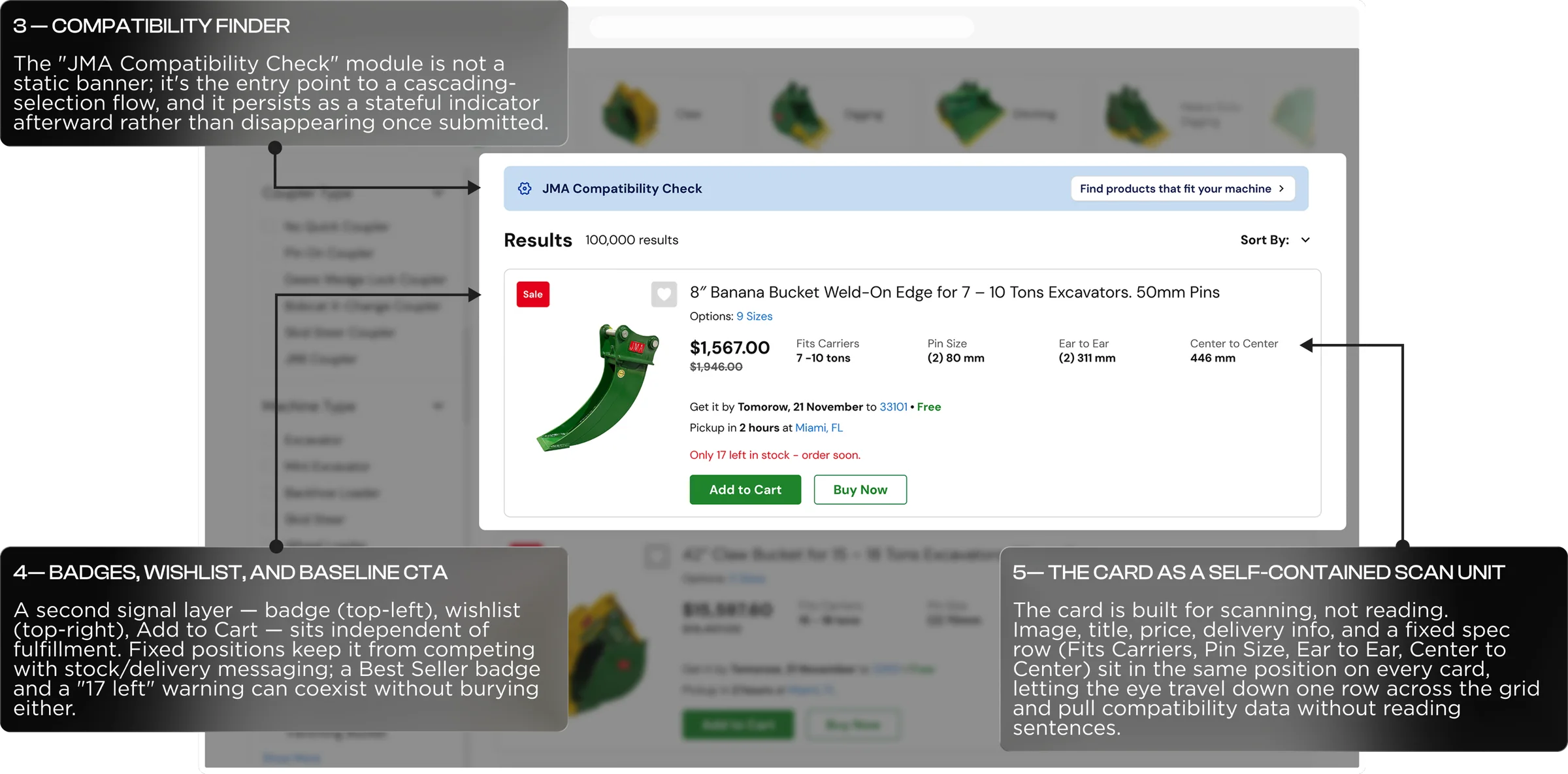
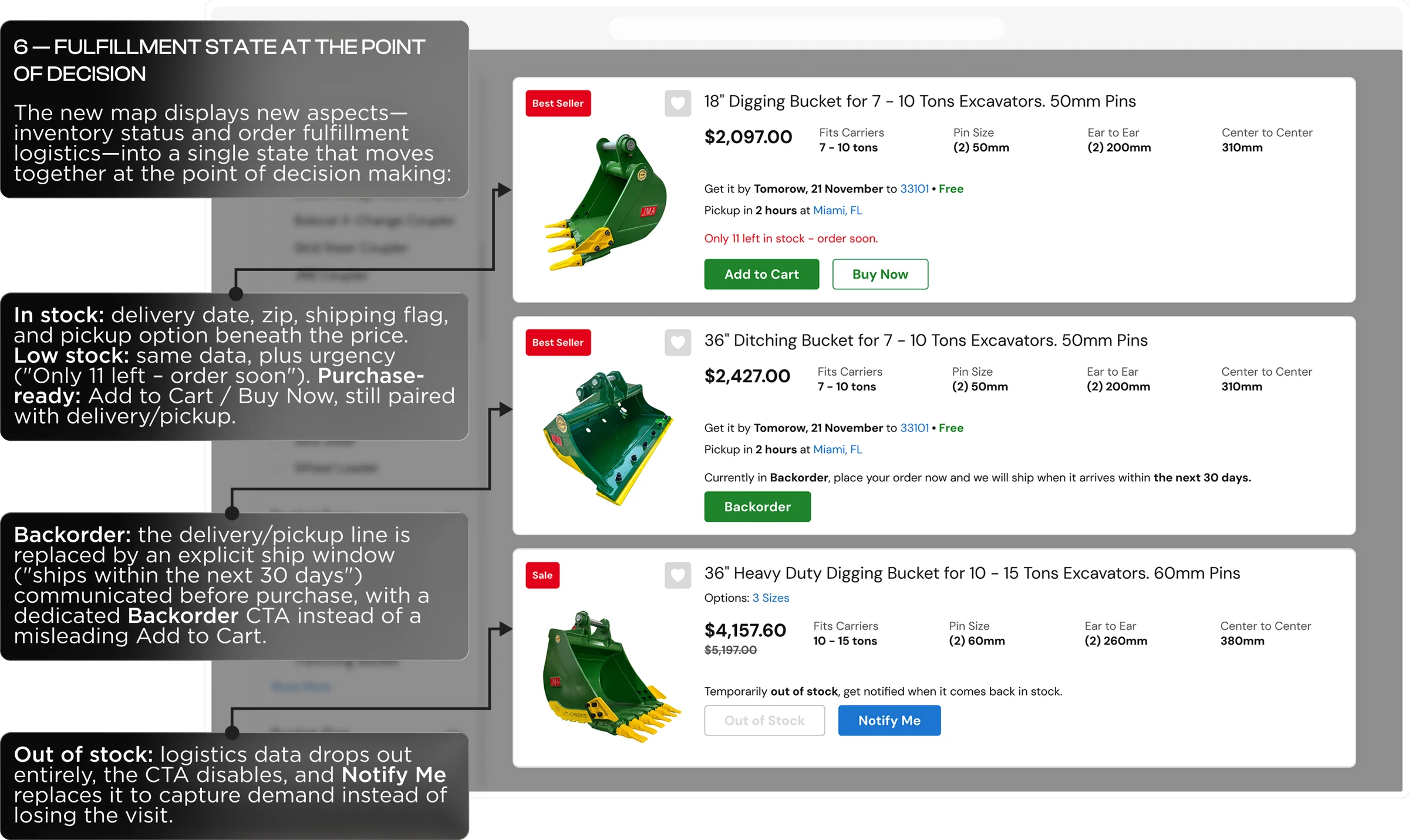
Second signal — cards showed only image, title, price; stock, delivery, and pickup stayed hidden until checkout, forcing slow one-by-one comparisons across 163+ SKUs, wasting effort on items that turned out backordered. This drove fulfillment state — availability, ETA, pickup — onto the card itself.
JMA Attachments
Key Pain Points
No compatibility check
Buyers had no way to confirm a bucket fit their specific machine before ordering — driving avoidable returns and exchanges on a fit-critical purchase.
No decision-support data
Stock status, delivery ETA, and pickup availability stayed invisible until a buyer opened an individual product page — or reached checkout.
No SEO strategy
Category copy was unrelated boilerplate, leaving the page without the on-page signal needed to rank for spec-driven searches and capture organic demand.
User flow
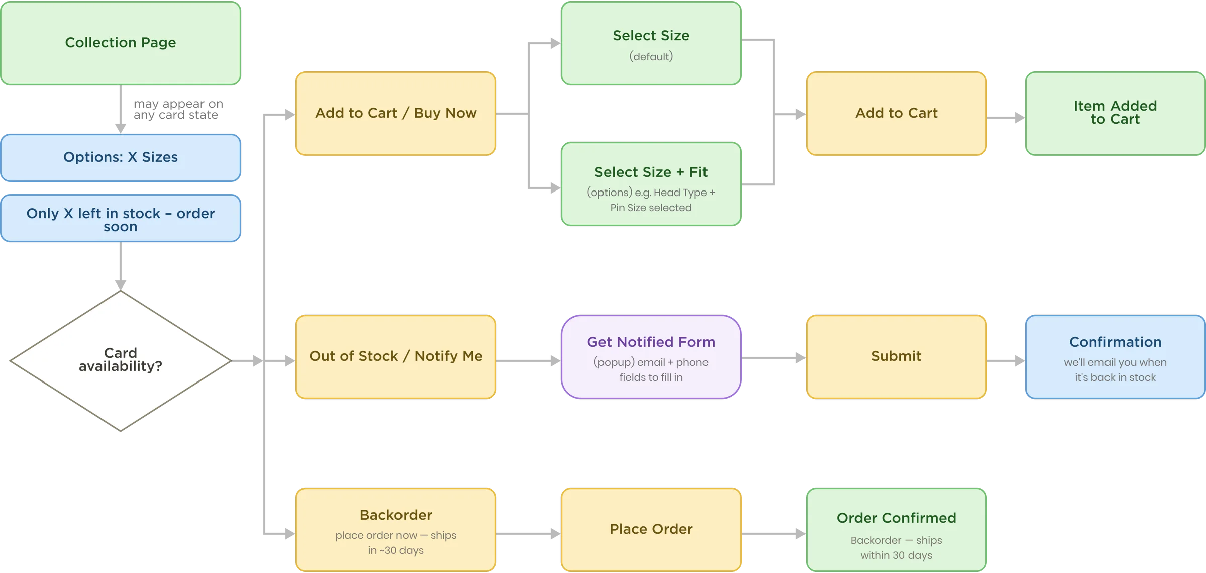
Collection page to product page — every card state
mapped end to end
- Decision (availability check)
- Screen / page
- User action (button / click)
- Info module / badge
- Modal / popup
(in-page interaction)
JMA Collection Page
Implementation Highlights
JMA Collection Page
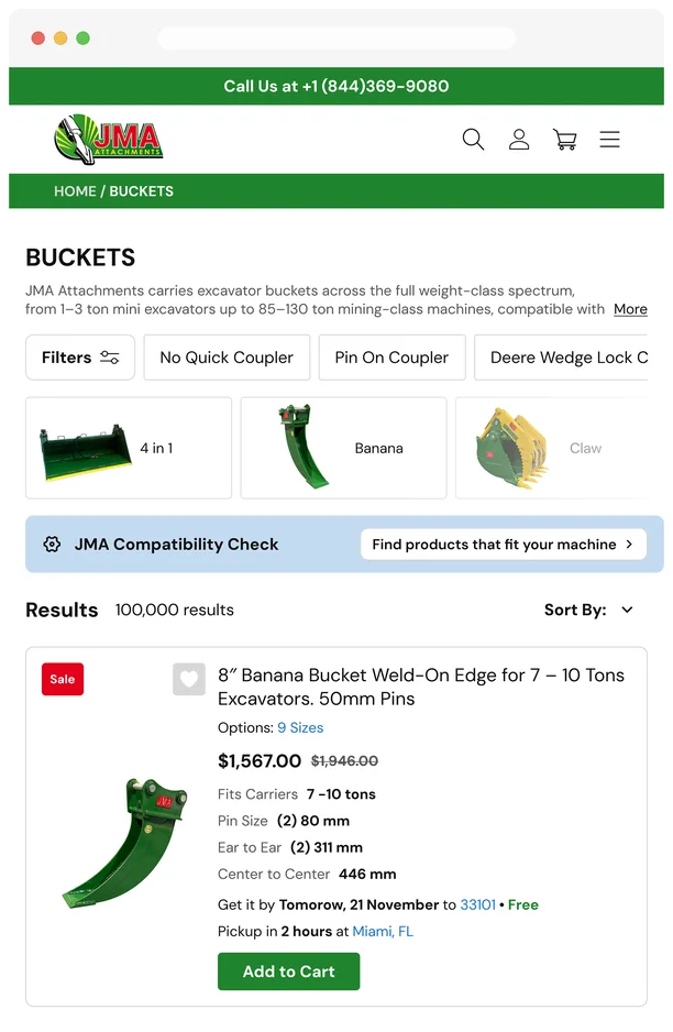
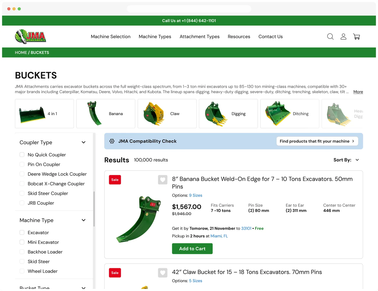
Responsive adaptation:
Filters & card layout
Nothing drops at any size; only orientation and disclosure change — sidebar to chips, single row to stacked, horizontal card to vertical.
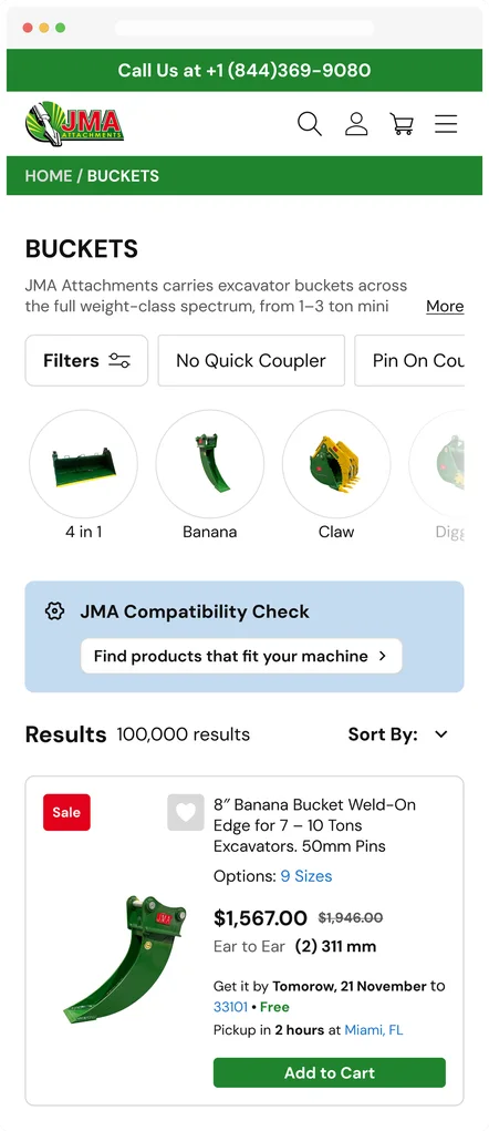
Mobile keeps the same chips, but Compatibility Check stacks — title on one line, CTA full-width below — and the card switches to vertical, since a four-column spec row can't fit a 320–375px screen.
Tablet collapses the sidebar into a "Filters" button with scrollable quick-filter chips; Compatibility Check stays single-row but tighter, and the card remains horizontal.
Desktop keeps the filter sidebar fully expanded and renders Compatibility Check as one row — icon and title left, CTA right — while the card spreads its four-column spec block and delivery/pickup info horizontally beside the image.
JMA Compatibility Check
From prompt to resolution
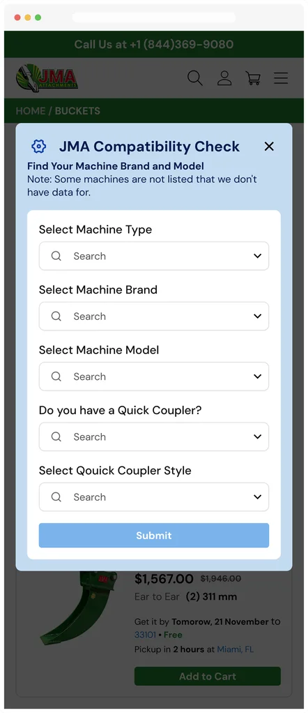
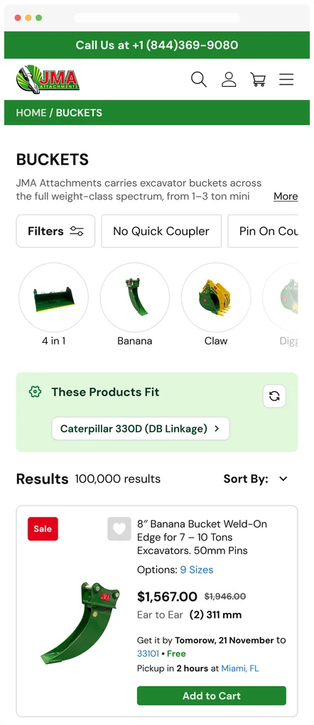
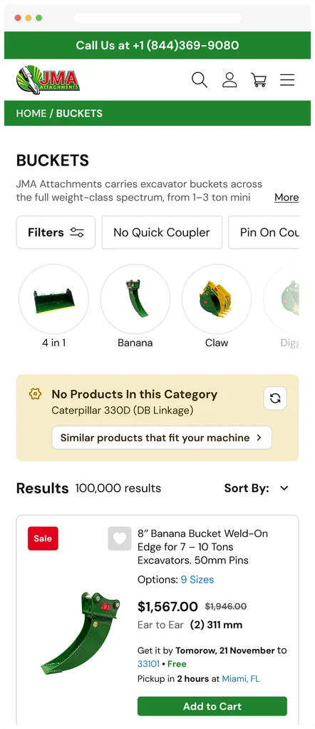
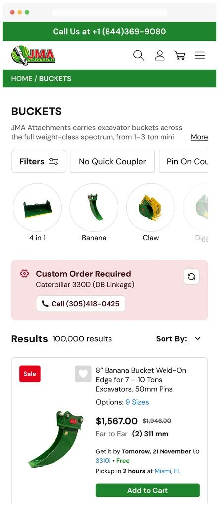
Process description
Shown at mobile width — all five states fit in one row for easy comparison.
The flow opens as a passive prompt above the results grid — "Find products that fit your machine." Tapping it opens a modal that walks the buyer through a dependent field sequence (Machine Type → Brand → Model → Quick Coupler → Coupler Style), with an upfront disclaimer that not every machine is in the database.
On submit, the module collapses back into the page as one of three persistent states: a green "These Products Fit" bar showing the resolved machine with a live-filtered result set; a yellow "No Products In This Category" bar that degrades gracefully to similar products instead of a dead end; or a red "Custom Order Required" bar that hands the buyer off to a phone call when no catalog match exists at all.
JMA Product Page
Configurable Fit:
Head Type and Pin Size Gate
Context & Problem
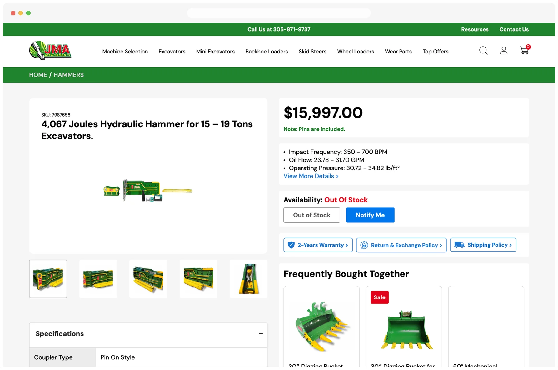
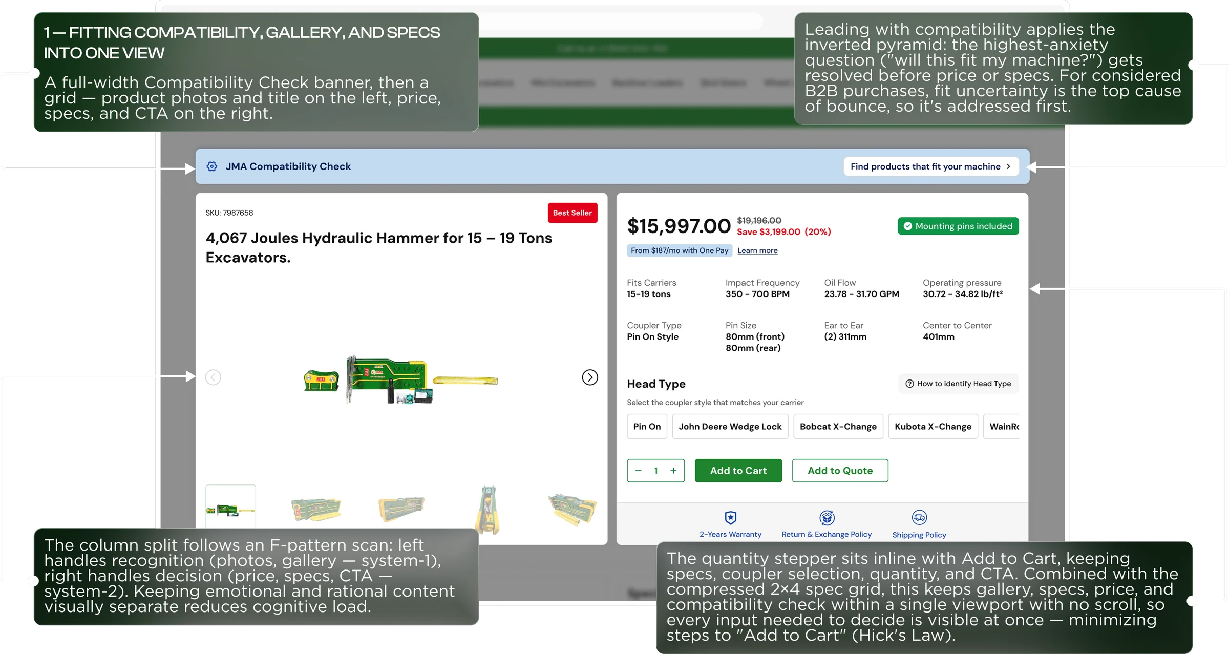
The legacy PDP buried the two facts a buyer needs before adding a $15,997 attachment to cart — coupler/head compatibility and pin size — behind a collapsed "Specifications" accordion and a "View More Details" link, with no way to select a Head Type or Pin Size on the page at all. Only three loose performance specs (Impact Frequency, Oil Flow, Operating Pressure) sat visible by default; fit-critical data required extra clicks just to see, and configuration wasn't possible before checkout. For a hammer that ships without a fixed head, that gap put the burden of getting compatibility right entirely on the buyer after purchase — a direct driver of returns and support calls.
Solution
The redesign leads with a full-width Compatibility Check banner before price or specs — resolving the highest-anxiety question ("will this fit my machine?") first, since fit uncertainty is the top cause of bounce on a considered B2B purchase. Below it, the page splits into an F-pattern column layout: the left column handles recognition (photo gallery, title), the right handles decision (price, spec grid, Head Type and Pin Size configuration, quantity, and CTA) — separating emotional and rational content to reduce cognitive load. The compressed spec grid, inline quantity stepper, and Add to Cart button all sit within a single viewport with no scroll, so every input needed to decide — and to configure the correct head type and pin size before checkout — is visible at once, minimizing steps to purchase.
JMA Attachments
By the end,
What Changed
A compatibility check on every card
A real-time fit check now confirms a bucket matches the buyer's machine before checkout, cutting returns on a fit-critical purchase.
Decision data, up front
Stock status, delivery ETA, and pickup availability now surface right on the collection card — no more waiting until checkout to find out.
Spec-driven SEO copy
Category pages now carry copy built around real search intent, giving the site the on-page signal to rank and capture organic demand.
Mobile
The same hierarchy, one column deep
One column, same order
On mobile, the two-column F-pattern layout collapses into a single scrollable column, but the hierarchy doesn't change: Compatibility Check still leads before price or specs, then the gallery and title, then price, spec grid, and Head Type/Pin Size configuration, ending in Add to Cart. What proves the system was built right is that this priority order — fit before price, price before configuration — survives the format change instead of needing to be reinvented for a smaller screen.

Configuration becomes a swipe, not a squeeze
The most telling adaptation is the Head Type selector. On desktop it's a single row of coupler options (Pin On, John Deere Wedge Lock, Bobcat X-Change, Kubota X-Change, WainRoy…) that already overflows the viewport. On mobile it becomes an explicitly horizontal-scroll chip row instead of shrinking each option to fit — every coupler style stays full-size and thumb-tappable, and the spec grid beneath it reflows from four columns to two rather than dropping any field.
Mobile
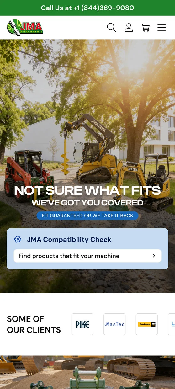
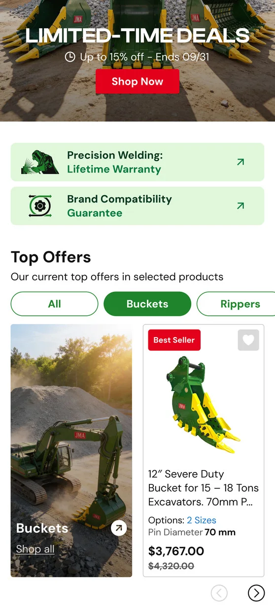
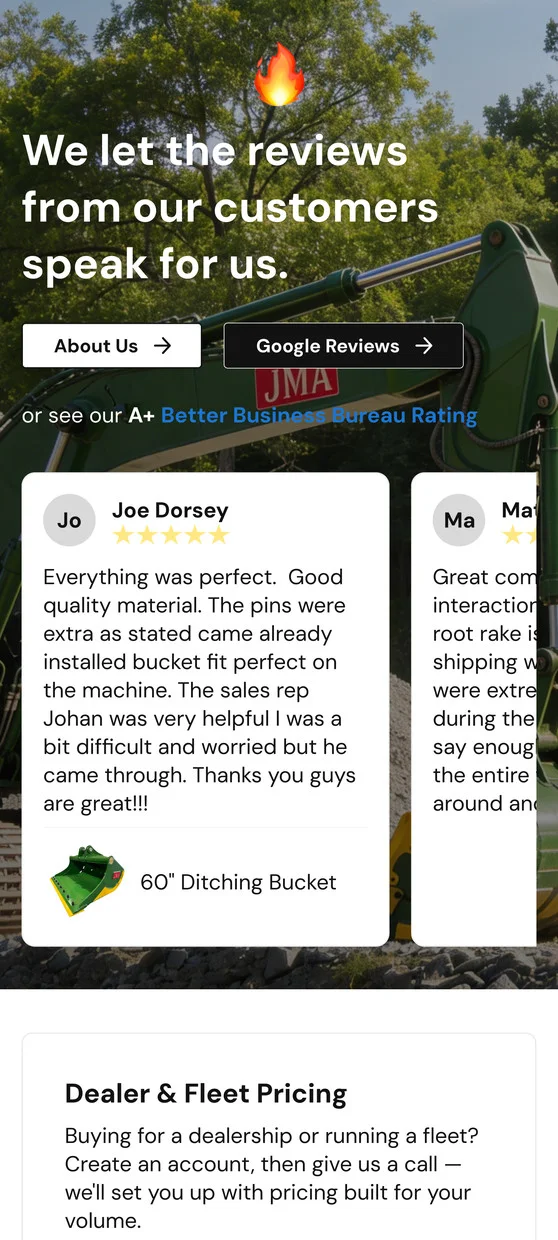
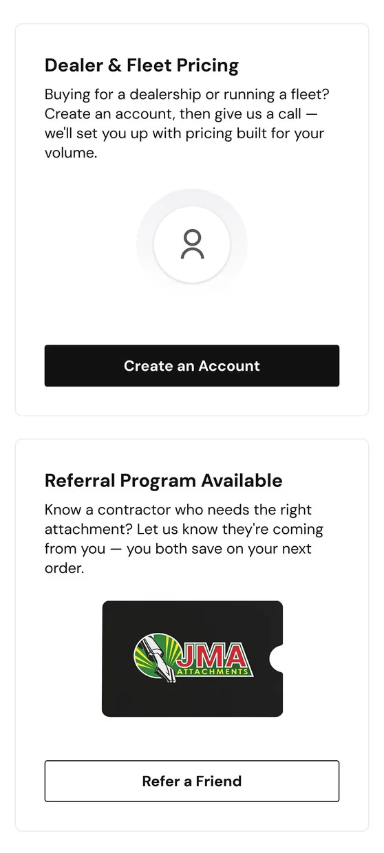
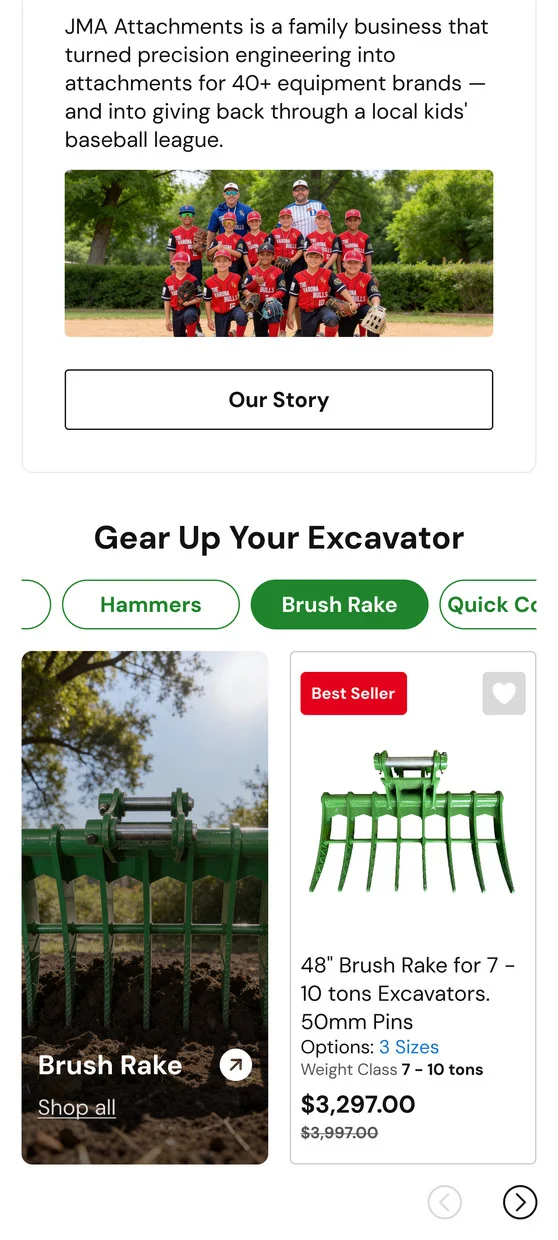
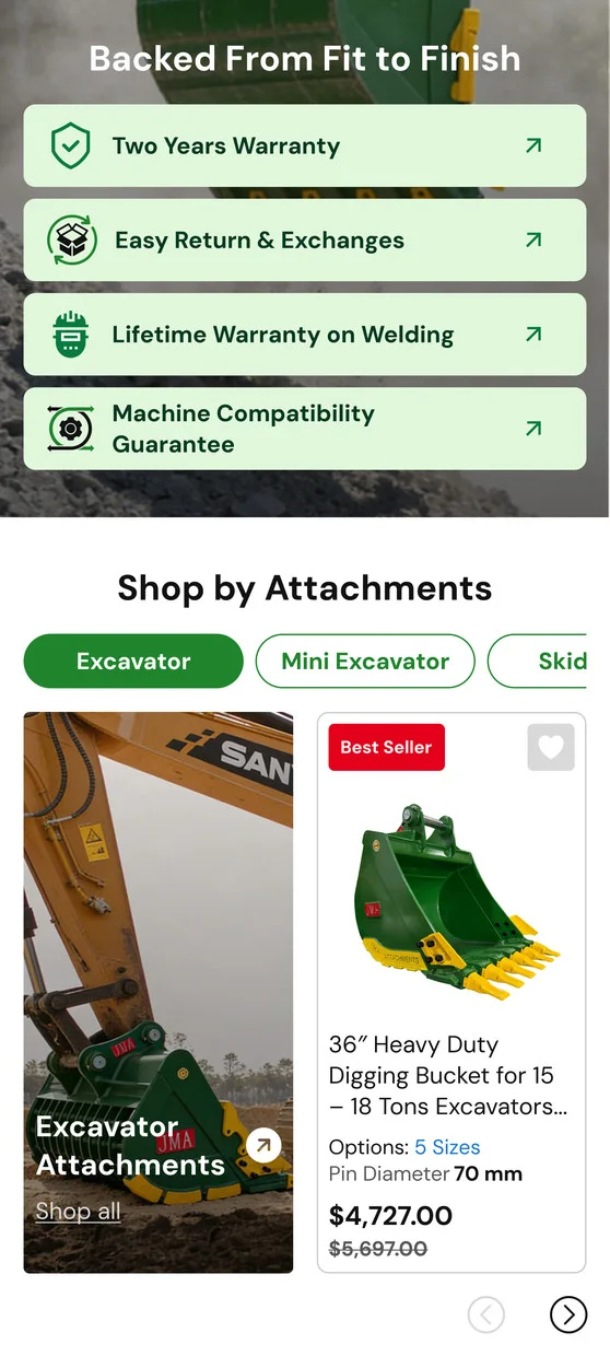
Home Page
Lessons
What this project
taught me beyond this one flow
Consistency compounds.
Reusing the same JMA Compatibility Check pattern — same icon, same color-coded states, same CTA language — across the collection page, the PDP, and every breakpoint meant buyers only had to learn what "green means matched, yellow means similar, red means call" once. A pattern repeated verbatim across surfaces builds trust faster than three bespoke ones, even when each surface's layout constraints are different.
A missing state is a design decision,
not an edge case.Backorder, out-of-stock, and no-catalog-match aren't failure states to hide — they're outcomes that happen constantly on a 100,000-SKU industrial catalog. Designing an explicit path for each one (ship-window messaging, Notify Me, a phone handoff) instead of defaulting to a disabled button or a dead end is what actually reduced ambiguity at the point of purchase. That principle isn't specific to hydraulic hammers — any inventory-driven catalog eventually has to answer "what if you don't have it," and leaving that state undesigned just pushes the problem onto support.