Cobalt
Building a Market Intelligence Platform
Solo designer end to end: discovery, sitewide user flow, page structure and responsive UI, with one card and one ranking pattern across the whole catalog.
- Role
- Product Designer (Solo)
- Timeline
- March–June 2025
Context & Problem
Cobalt’s rankings were an idea, not a product: buyers had no place to browse trends, compare brands or open a single item. I designed the whole website from scratch: a Home dashboard, Trend and Brand Intelligence pages, and a Product Page, all responsive.
Results
A platform with no
pages yet
Giving buyers direct access to Cobalt’s AI-powered trend rankings, and a path from every insight to a product they can actually source.
A first digital product, with its system
Designed Cobalt’s first digital product from scratch, with a design system of tokens and reusable components that keeps every page consistent on desktop and mobile.
An AI-powered trends dashboard
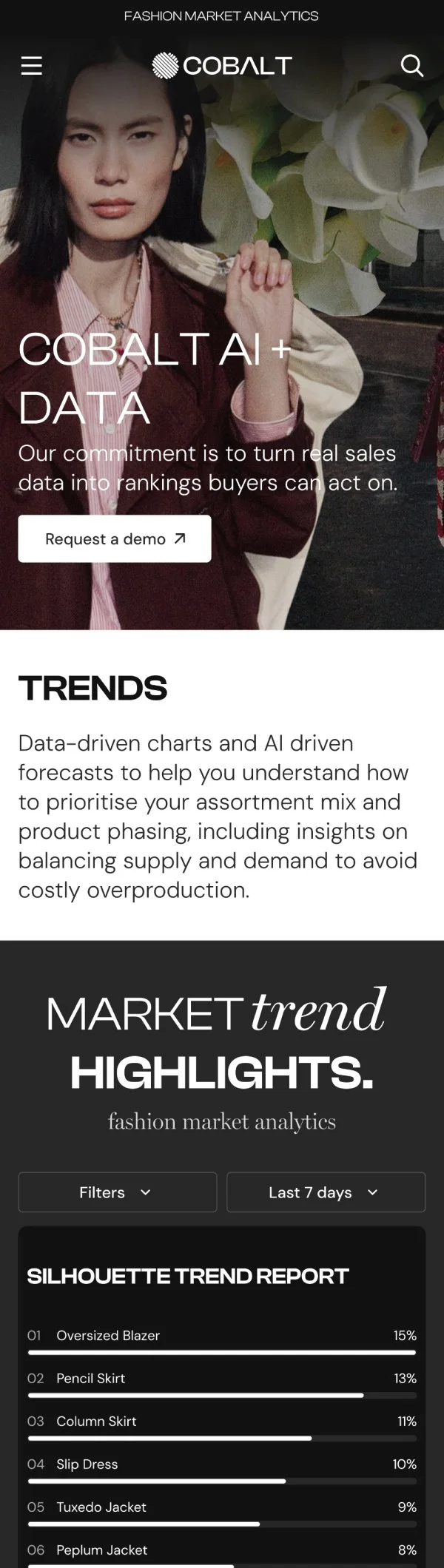
Designed the Home dashboard where buyers filter data by time period and see color and silhouette rankings side by side.
1 step from insight to buyable
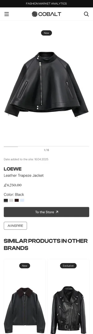
Every ranked item opens a Product Page with a direct route to the retailer.
Pages
Cobalt
Problem Discovery:
A platform with no pages yet
Context & Problem
The rankings were a new idea for Cobalt, not a product yet. There was no place for a buyer to browse trends, compare brands or drill into a single ranked item.
This case study covers designing that page set from scratch: a Home dashboard, dedicated Trend and Brand Intelligence pages, and a Product Page, each with a responsive version.
Cobalt
Key Pain Points
No product to start from
Cobalt was moving from selling fabrics to selling insight. There was no existing structure, navigation or patterns, so every decision about how buyers read the data had to be made from scratch.
No path from ranking to product
A trending color or silhouette means little to a buyer on its own. Without a link from an insight to an actual, buyable item, the data would stay interesting but not useful.
Three datasets, no shared structure
Colors, brands and silhouettes are different kinds of data. Without one common way to present them, buyers would have to re-learn the page every time they switched datasets.
User flow
How a buyer moves through
the whole platform
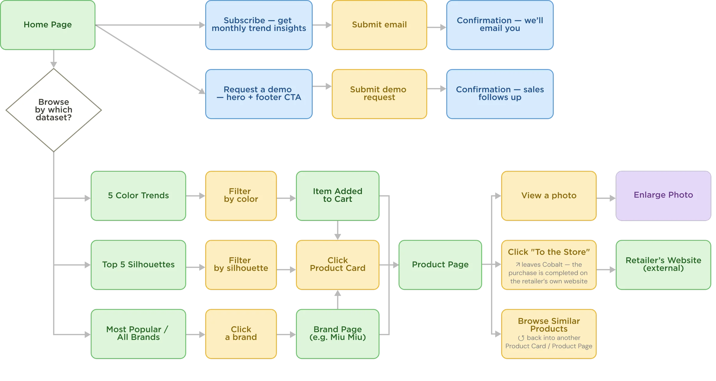
- Decision (availability check)
- Screen / page
- User action (button / click)
- Info module / badge
- Modal / popup (in-page interaction)
From the Home dashboard, a buyer reaches every dataset (colors, silhouettes, brands) and every product the same way, always through the same Product Page — where “To the Store” hands them off to the retailer's own site to complete the purchase. Cobalt's job ends at the insight, not the transaction.
Cobalt System Audit
pattern consistency,
not just a clean screen
pattern
pattern breaks
pattern
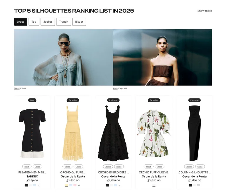
The top nav presents Colors, Silhouettes and Brands as three equal entry points to the platform's data. Comparing the three sections side by side checks whether the UI actually treats them as equal — or only two of them.
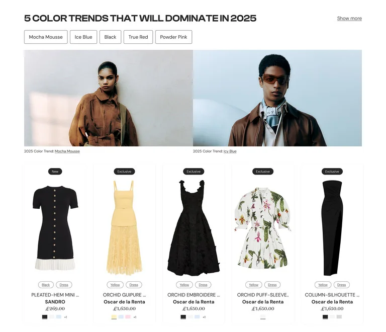
1 — The shared pattern (Colors & Silhouettes)
On the Home dashboard, both sections run the same formula: rank chips that double as filters, sitting on a 5-card grid. Ranking and filtering aren't two separate UI ideas here — they're the same row of elements. That's one reusable module, not a set of one-off layouts.
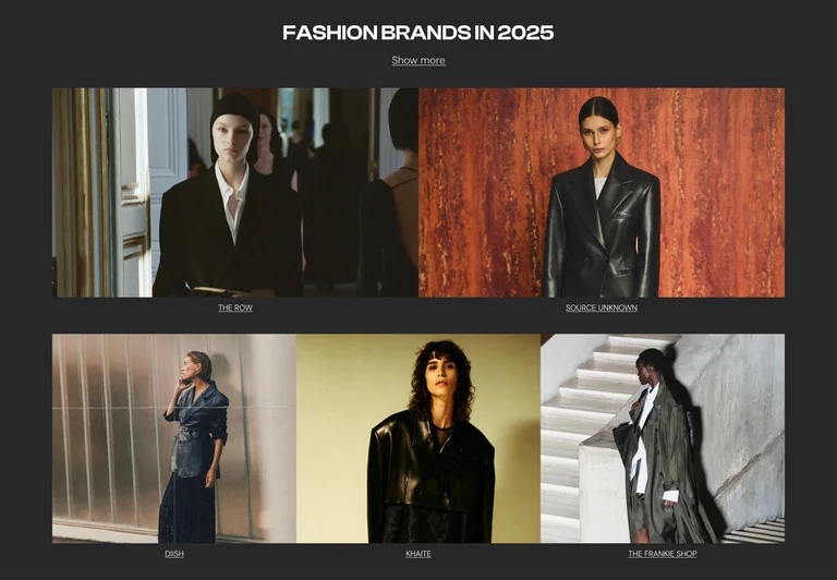
2 — Where the pattern breaks (Brands)
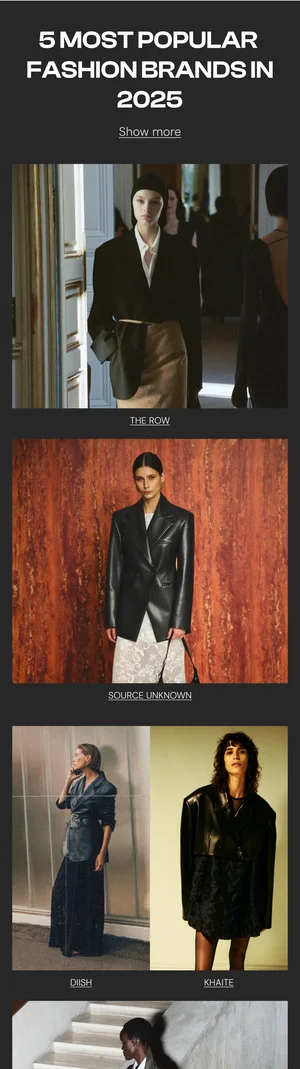
On Home, Brands is the only one that reverts to a plain editorial grid — no rank chips, no product cards. Two of three datasets teach one interaction model; the third quietly teaches a different one, two scrolls later.
Cobalt Product Card
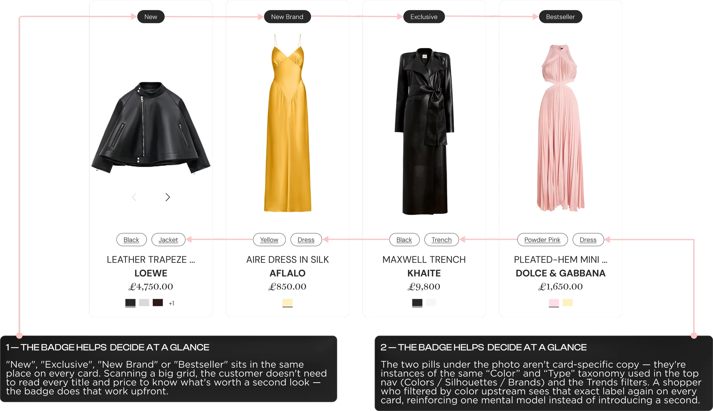
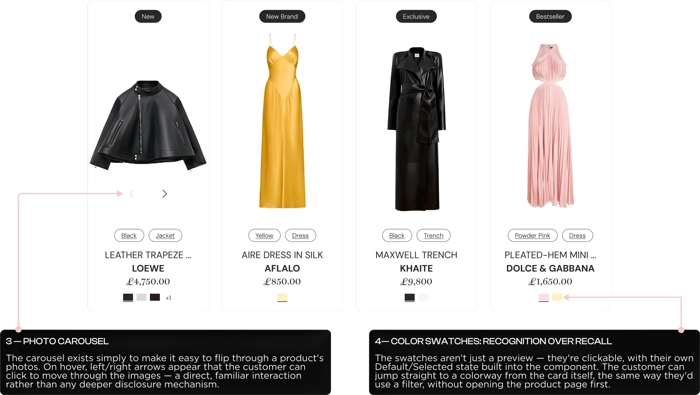
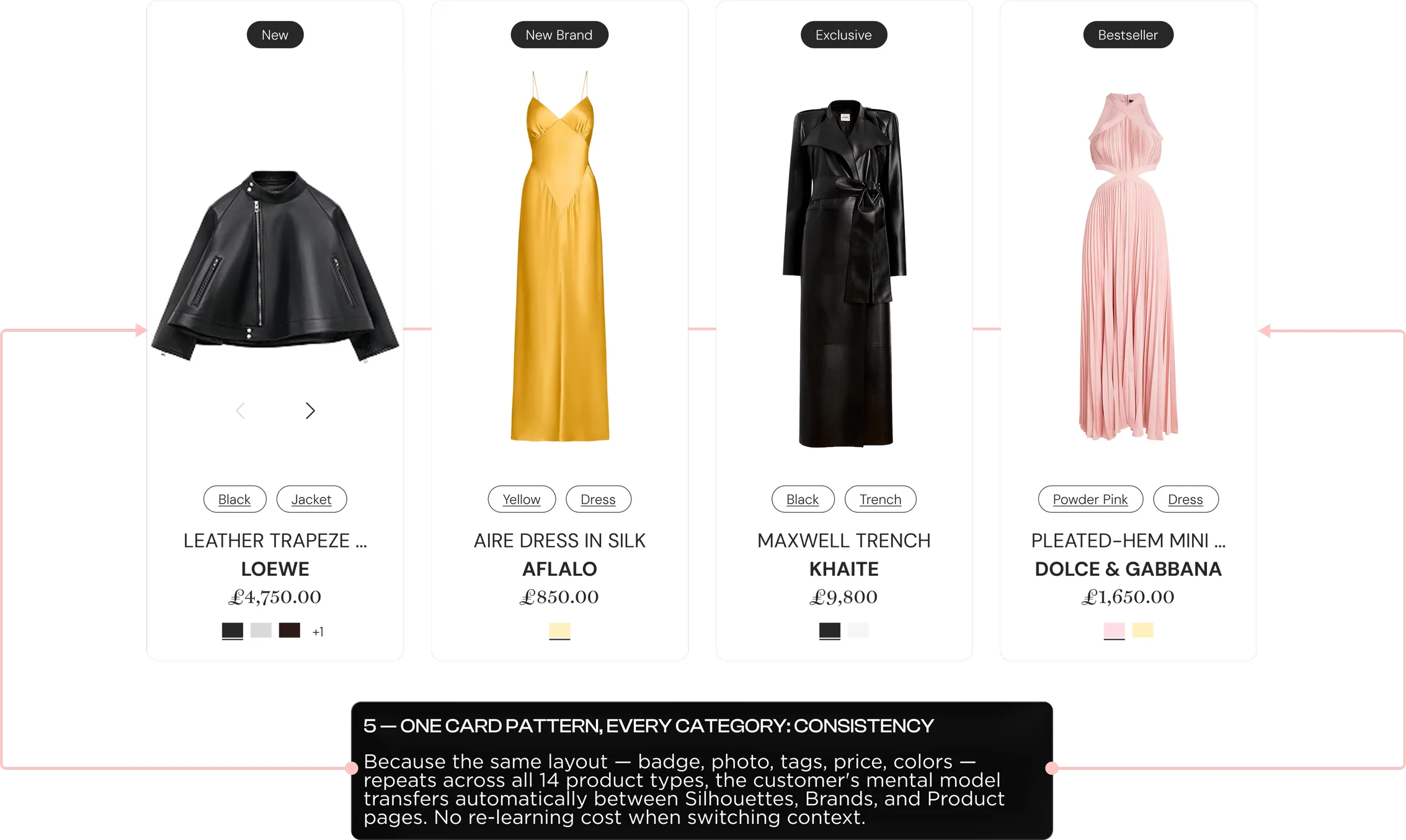
One card component,
built to carry the whole catalog
Cobalt System
How the page converts
in four stages

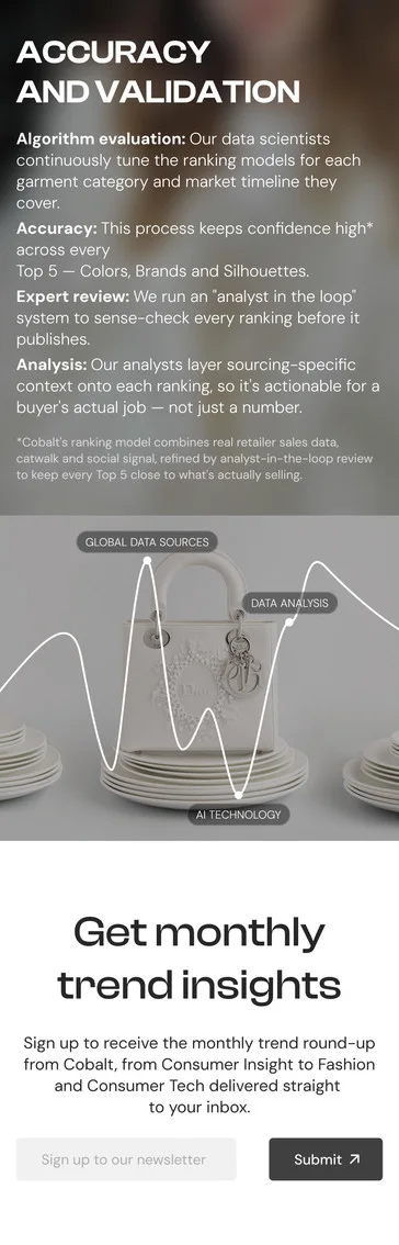
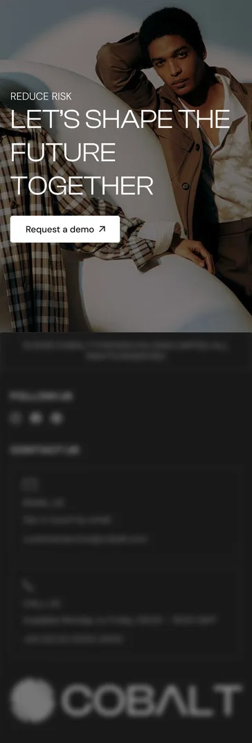
Same CTA, asked twice
- Header — Hero CTAAsk: Request a demo
Commitment: High - Accuracy & ValidationAsk: none — proof only
Role: builds trust - Newsletter — we’ll email youAsk: Email signup
Commitment: Low - Footer — Final CTAAsk: Request a demo
Commitment: High
- High-commitment ask
- Trust / proof only
- Low-commitment ask
Process description
Two high-commitment CTAs (hero + footer) bracket a low-commitment one (Subscribe), with a trust section (Accuracy & Validation) doing the convincing in between. Different intent levels get different asks — nobody has to over-commit, and nobody leaves empty-handed.
Same Nav Bar,
Three Different Experiences
Context & Problem
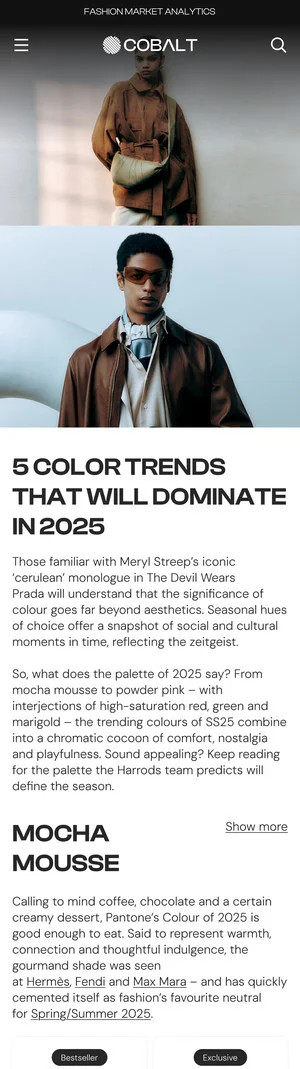
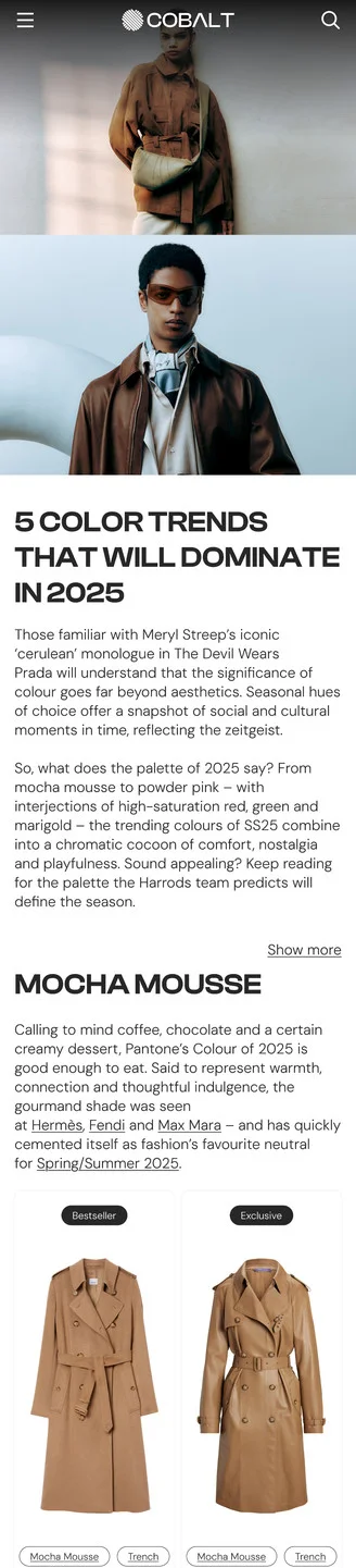
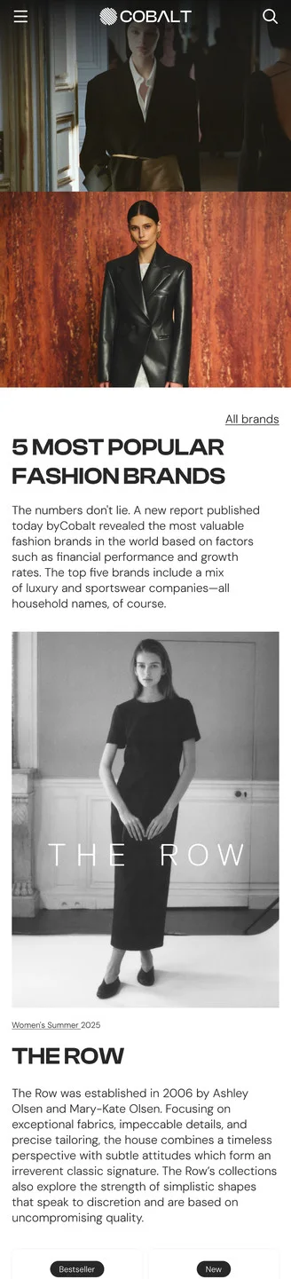
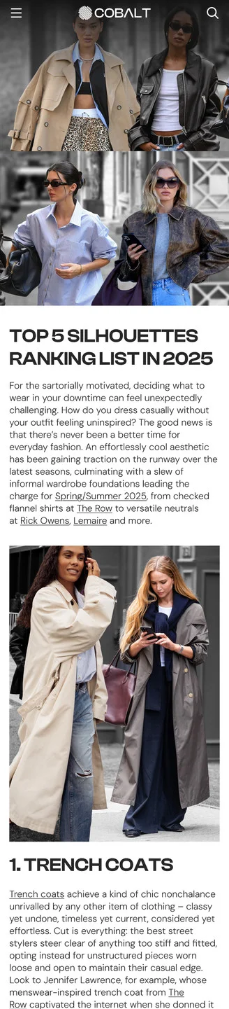
One level deeper, the gap widens. Inside each category page, the #1-ranked item renders in a completely different layout. Colors shows a shoppable card grid — image, brand and price per item. Silhouettes drops to a loose row of plain photos with no cards. Brands drops further still, to one full-bleed editorial image and a paragraph — no way to compare items at all. A buyer's ability to scan and compare depends entirely on which dataset they happened to click, even though the nav promised the three were interchangeable.
Solution
Standardize the ranked-item layout across all three categories on the pattern that already works — Colors' card grid: image, brand and price per item, consistently sized and spaced. Rebuild the Brands and Silhouettes sections on that same grid instead of their one-off editorial layouts, so every dataset a buyer opens delivers the same scannable, comparable format. Consistency here isn't cosmetic — it's what makes the nav's promise of three equal categories actually true, and it removes the extra cost of re-learning how to read the page every time a buyer switches datasets.
Directory, Repeated —
The Differentiator Buried
Context & Problem
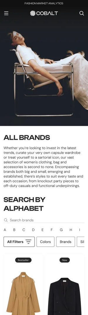
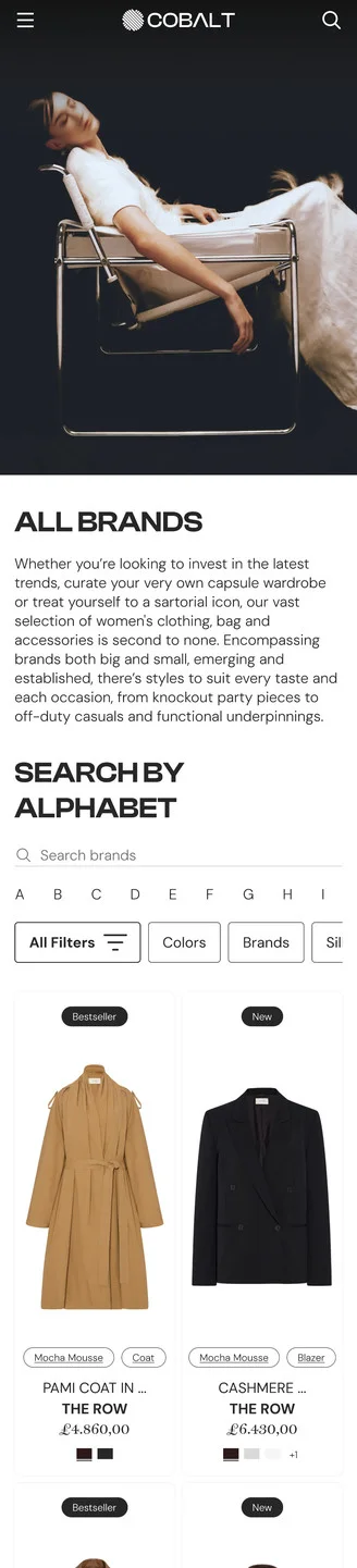
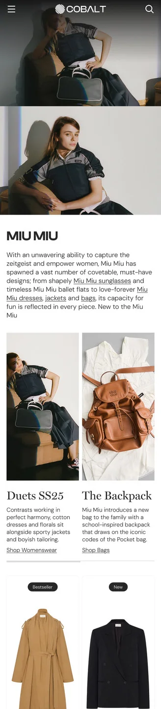
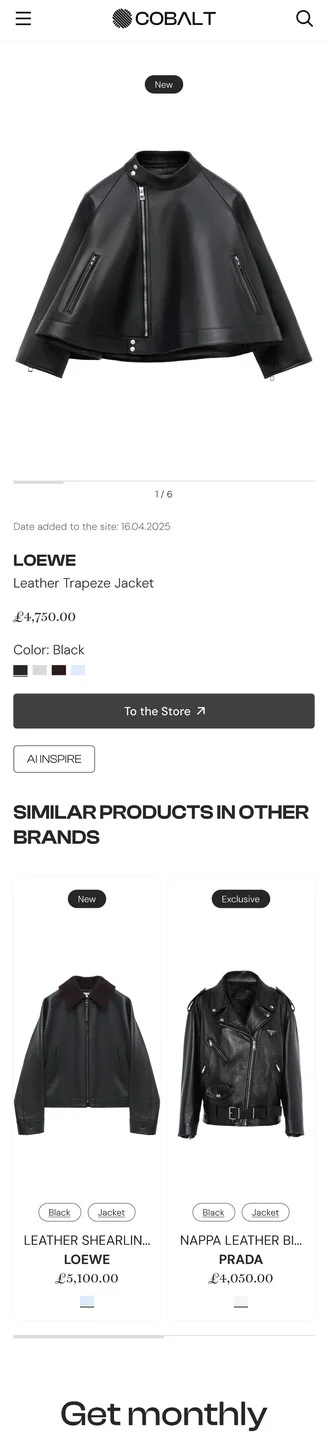
The path from All Brands to a specific product routes through pages that repeat the same content. All Brands leads with an A–Z directory, then drops into the same trend editorial cards ("Duets SS25," "The Backpack") a buyer already saw on Home and Colors; the Miu Miu brand page repeats those exact cards again under "Search Trends" before showing anything brand-specific. By the time a buyer reaches the Product Page, the one feature that reflects Cobalt's real value — cross-brand comparison via "Similar products in other brands" — sits below price, size and "To the Store," easy to miss for a buyer who decides, or bounces, before scrolling that far.
Solution
Give the All Brands page one job: let it be the A–Z directory, and move trend editorial content to the pages that already own it (Home, Colors, Silhouettes) instead of repeating it on every brand-adjacent page. On the Product Page, promote "Similar products in other brands" up near price and the CTA — it's Cobalt's actual differentiator, data-driven comparison across the whole market rather than one retailer's shelf — so it doesn't compete for attention with content the buyer has already scrolled past twice.
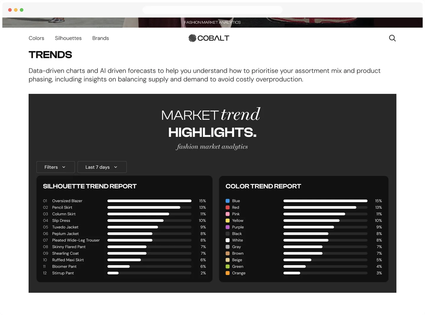
Trends Module
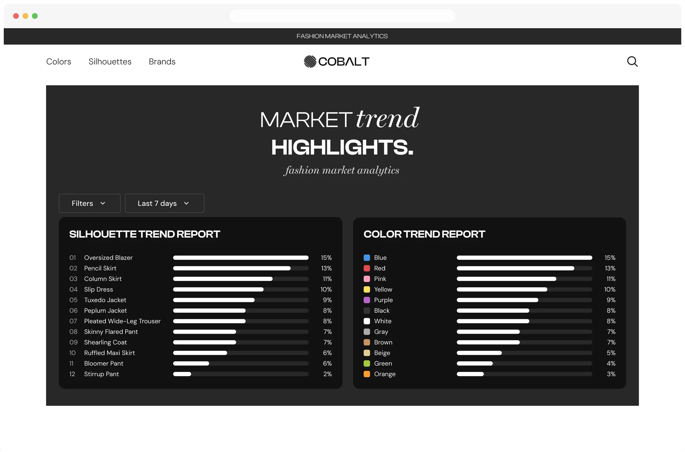
turning market data
into a buying decision
Why It Matters
This is the one section where the AI platform stops describing itself and starts proving it. The framing copy states the buyer’s actual job, prioritizing assortment and avoiding overproduction, before any chart appears. The “Last 7 days” control scopes the data, so it reads as a measurement, not an eternal truth.
Design Decisions
A ranked bar list matches the actual task: fast, preattentive reading of rank and magnitude. Color only carries meaning where it's real — hue-coded for Color Trend, one accent for Silhouette — and both panels share a single % scale so they're directly comparable. What's still open: no momentum signal, and “what's trending” isn't yet “what to reorder” — that gap is where the demo CTA picks up.
Cobalt
What
the platform gained
A single dashboard
Colors, Brands and Silhouettes sit side by side on one Home dashboard, ranked from real sales data, so buyers see the whole market at a glance.
A path from ranking to product
Every ranked item opens a Product Page with a direct route to the retailer, so an insight is always one step away from something a buyer can source.
Self-serve access
Buyers browse and filter Colors, Brands and Silhouettes whenever they need an answer. The data is theirs to explore.
Cobalt
My role
and impact
Owned end to end
Solo designer: discovery, sitewide user flow, page structure, and UI for desktop and mobile.
One card for the whole catalog
Built a single product card component that carries every item.
A path matched to buyer readiness
Designed the landing page conversion path with CTAs for different levels of readiness.
One ranked-item pattern
Explored layout concepts for each dataset, then chose one consistent pattern across all three categories.