eWallet
Redesigning the Main
Withdraw Funds
interface
Solo designer end to end: live-product audit, flow mapping, Support-driven requirements, responsive UI and developer handoff, with no documentation to start from.
- Role
- Product Designer (Solo)
- Timeline
- April–June 2026
Context & Problem
eWallet is a digital wallet product where users withdraw funds through banks, cards, wire transfers, prepaid cards, and crypto. I joined as the sole product designer on this interface, with no existing documentation to build on — every pain point had to be found and diagnosed directly in the live interface.
Results
From clutter to
confident withdrawals
Turning a cluttered, single-page withdrawal screen into a clear, guided experience — with no product documentation to start from.
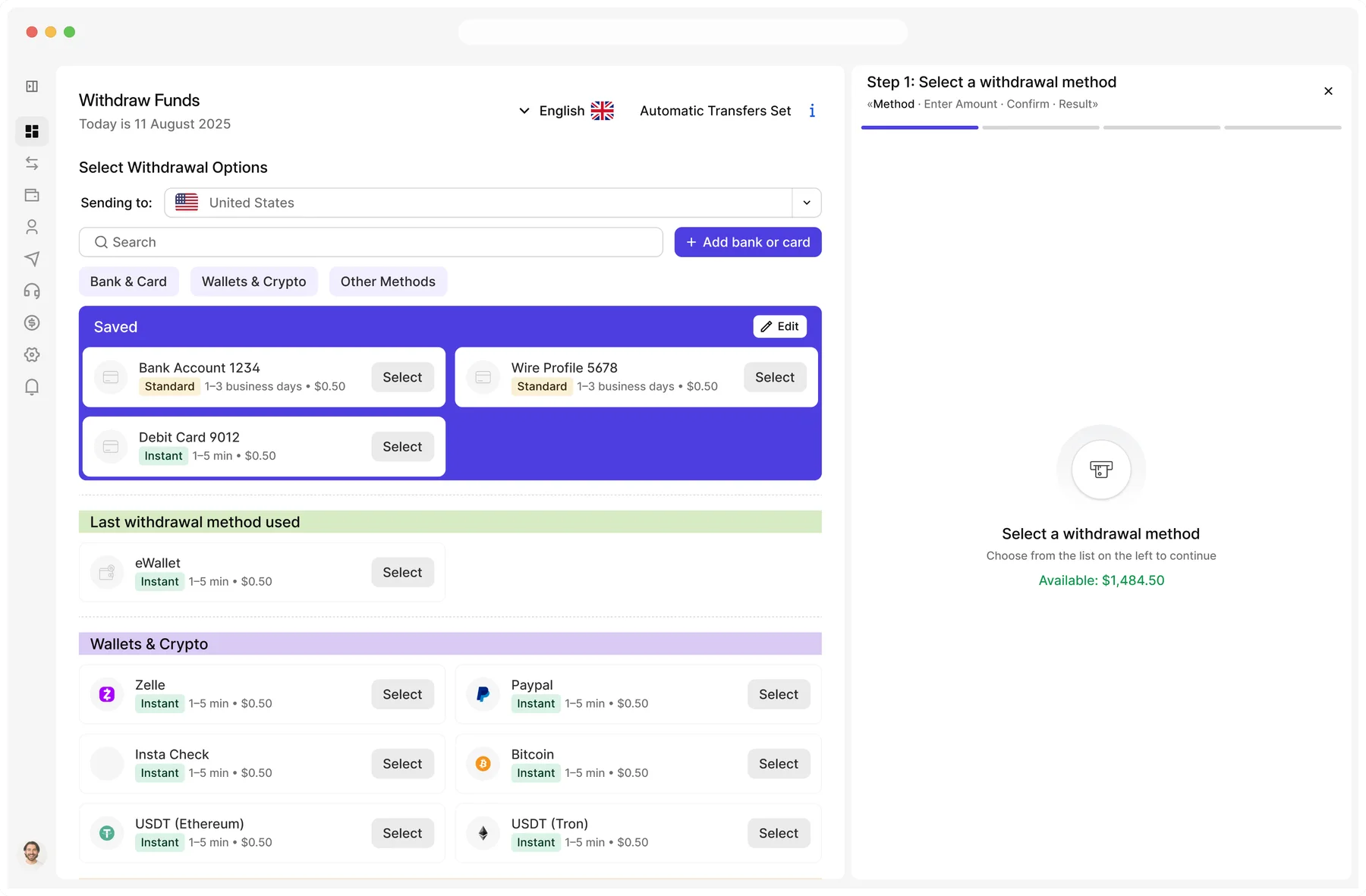
1 flat list → 3 categories
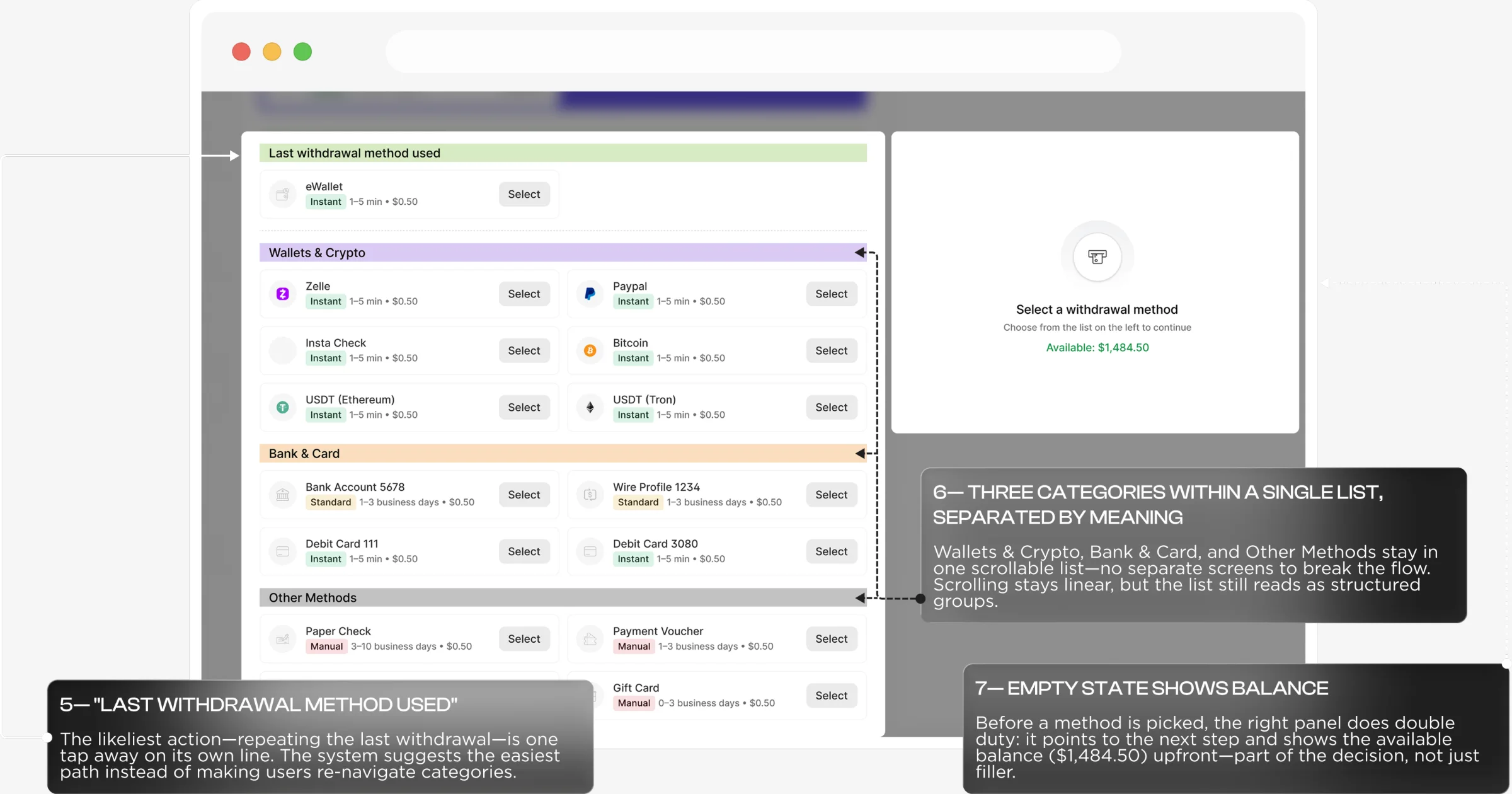
20+ methods restructured: saved methods first, a last-used shortcut, then three grouped categories.
Fees and timing
Fees and processing times moved from Confirm to method selection, so users compare before committing.
4 add buttons → 1
One “+ Add bank or card” button replaces four hidden ones and opens as a modal, so users stay on the dashboard.
eWallet
Problem Discovery: Support Signals
Context & Problem
First signal — the Support team flagged that international customers regularly struggled to find the country/region switcher, buried in the interface. With a large international user base, this became a concrete, evidence-based requirement: promote it to a visible, persistent dashboard control.
Second signal — users frequently backtracked or abandoned withdrawals after discovering fees and processing times only at the Enter Amount/Confirm step (Zelle, crypto, PayPal, gift cards). This became a requirement to show fees and processing times upfront, on the method-selection screen.
eWallet
Key Pain Points
Information overload
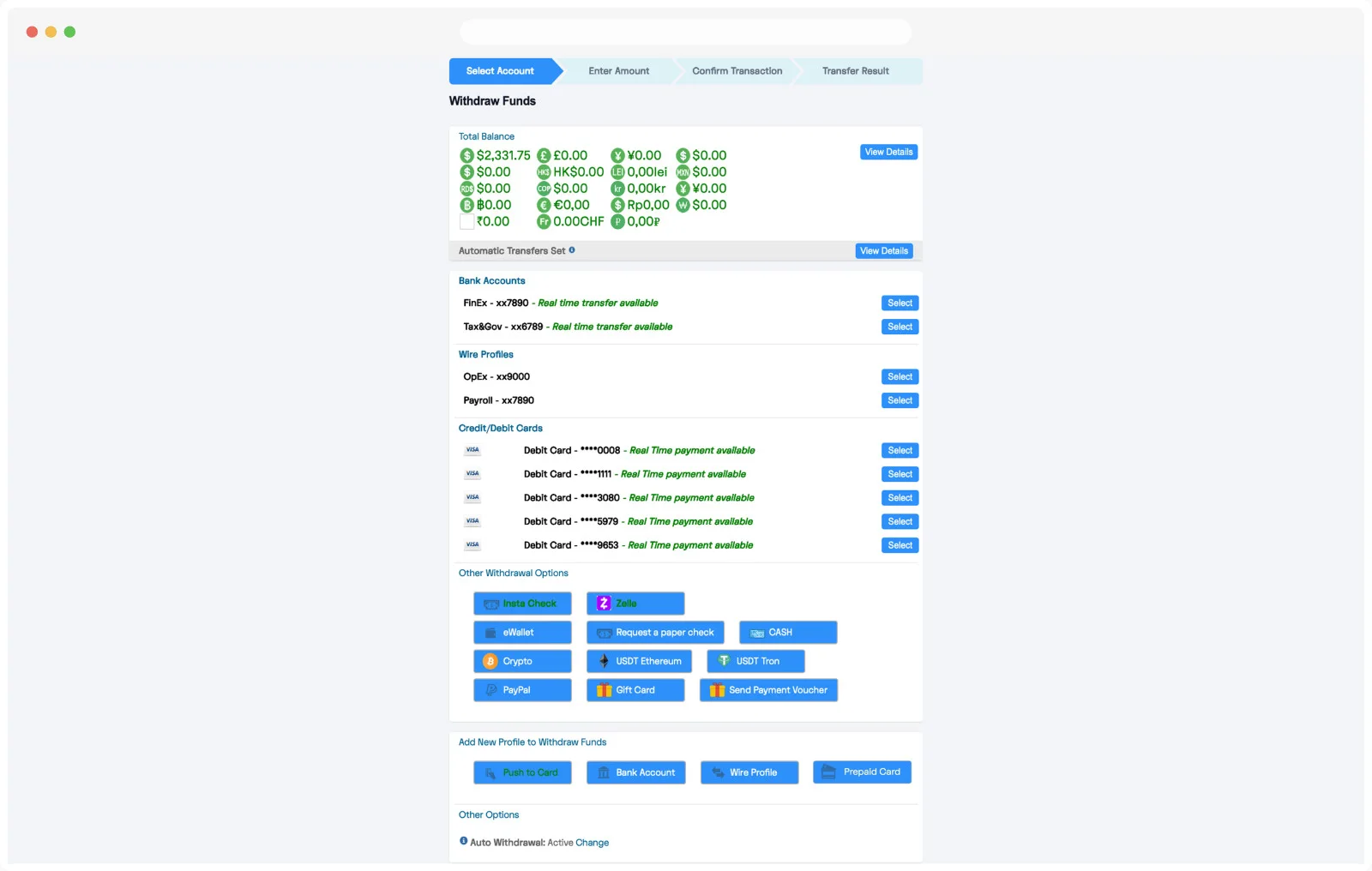
20+ withdrawal options — bank accounts, wire profiles, cards, crypto, vouchers — shown as one flat, equally-weighted list with no grouping.
No decision-support data
Fees, processing times, and "last used" status were invisible until a user was already deep inside a specific method.
Scattered entry points
Bank-related actions were split across unrelated sections (Bank Accounts, Wire Profiles, Add New Profile), so it was unclear where to start.
User flow
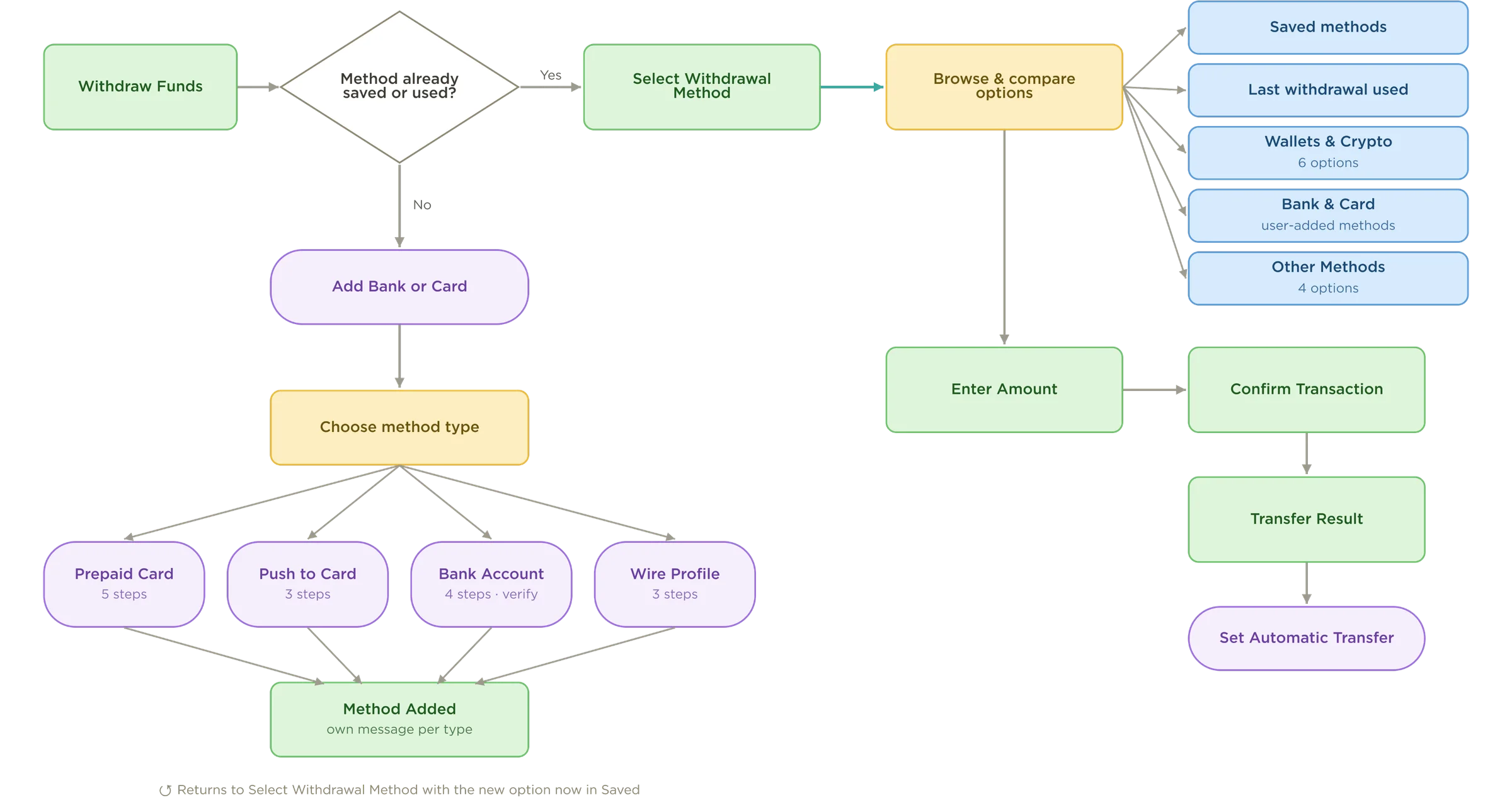
Every screen, decision,
and popup — mapped end to end
- Decision (yes / no)
- Screen / page
- User action (not a decision)
- Info module
- Modal / popup (in-page interaction)
eWallet Dashboard
Implementation Highlights
Bank Account
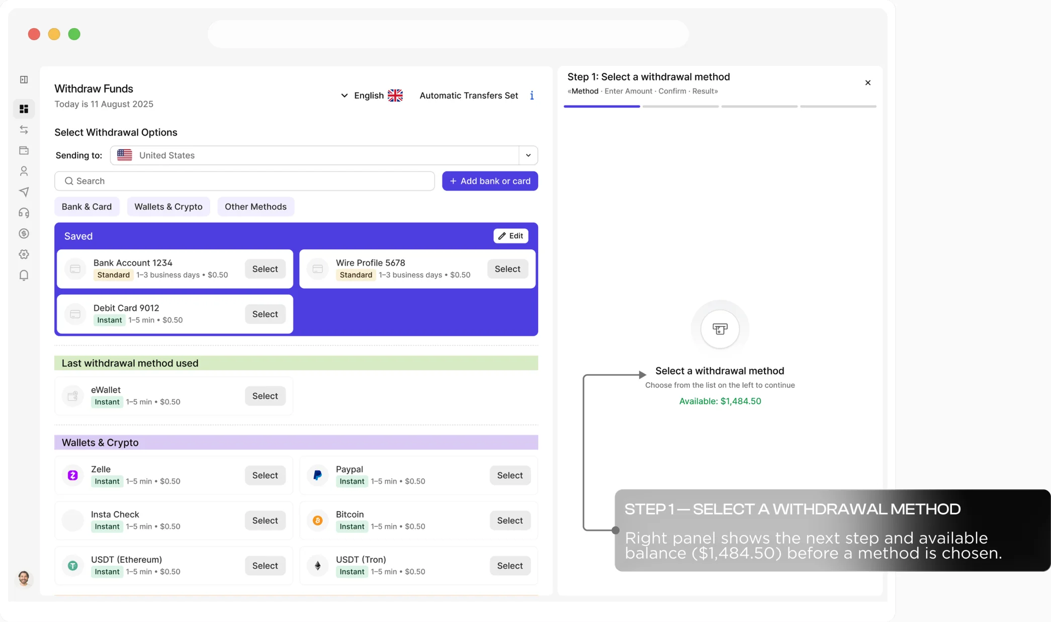
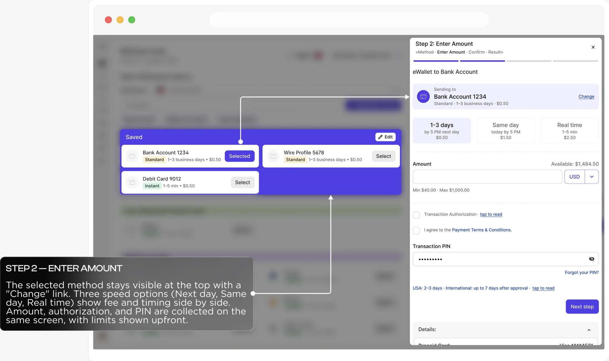
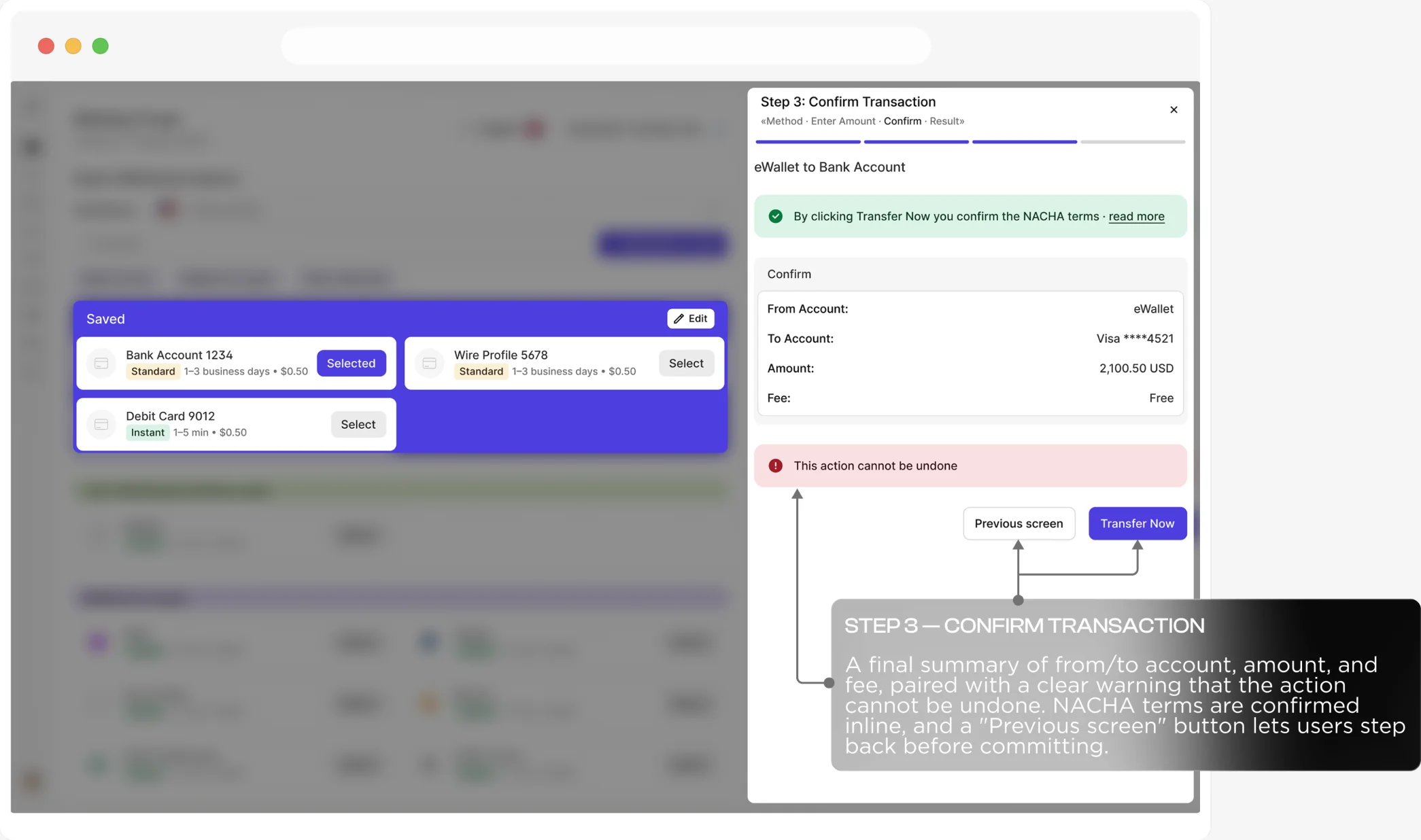
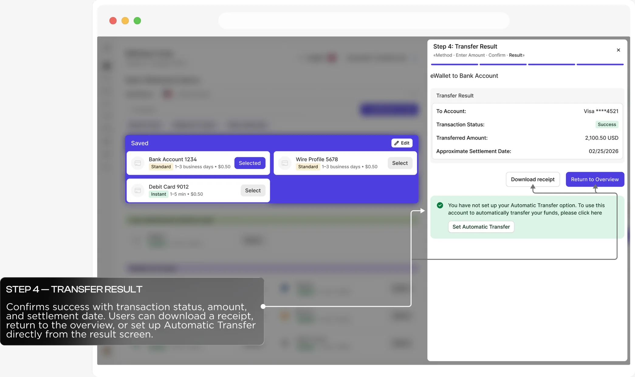
Withdraw funds in 4 steps
Pop-up
The UX behind
Add bank or card
Context & Problem
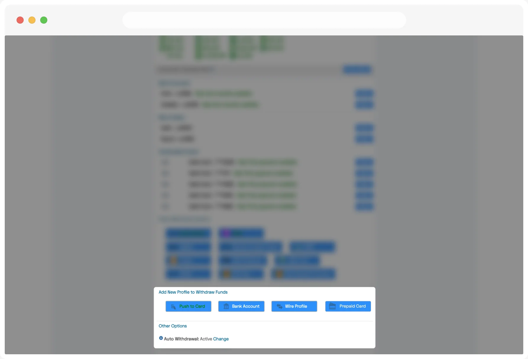
The option to add a new payment method didn't sit next to the user's existing accounts — it lived in a separate section at the very bottom of the page, as four separate buttons. To reach it, users had to scroll past every existing method, even when they already knew they needed something new.
Clicking it took users off the dashboard entirely, to a separate page with its own workflow, disconnected from the balance and accounts they'd just scrolled through. There, after choosing a card type, they had to read through a table crammed with legal fields. The next screen, before any payment could happen, showed one long stream of information: name, address, date of birth, phone number, email, an automatic-transfer toggle, two legal agreements, and a transaction PIN.
Solution
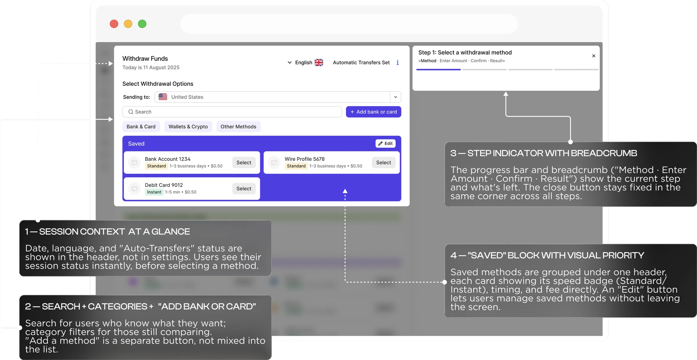
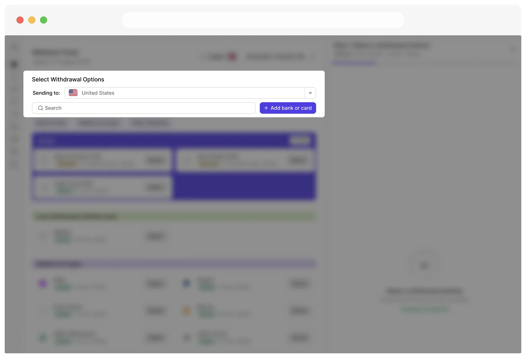
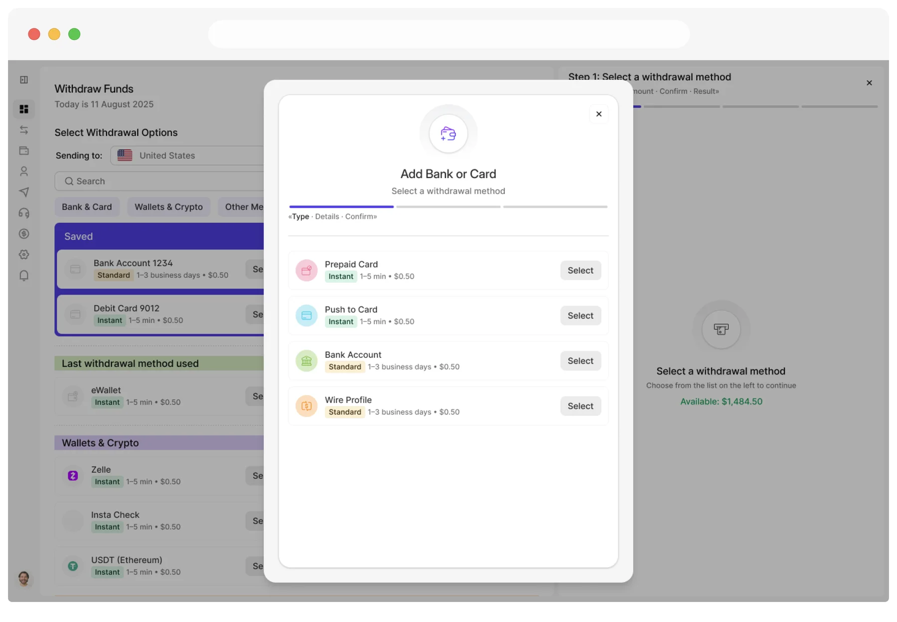
Adding a method is now one click from where the need appears: a single "+ Add bank or card" button sits right beside search, above every saved account.
Instead of sending users away from the dashboard, it opens as a modal directly over the withdrawal screen — the balance and saved methods stay visible, dimmed behind it, so the original task never disappears. Choosing a prepaid card opens "Order prepaid card," a nested wizard that reuses the same step indicator as the rest of the product (Card · Info · Payment · Confirm · Result), so stepping into it never feels like switching tools mid-task.
Add Bank or Card, solved
Order a prepaid card in 5 steps
Takeaways
By the end,
Withdraw Funds had
Clear choices, up front
Saved methods now come first, followed by the last-used shortcut and grouped categories. Fees and processing times sit on the method list itself, so users compare speed and cost before committing — and can step back mid-flow if the terms don't work.
One pattern, everywhere
Search and categories split "I know what I want" from "I'm comparing." The step indicator, close button, and irreversible-action warning behave the same for every method — including inside Add bank or card, which reuses the main stepper instead of feeling bolted on.
What's next
Next, I'd test whether "Set Automatic Transfer" comes at the right moment to ask, and look closer at what happens when a new method fails verification mid-flow.
Mobile
The same hierarchy, one column deep
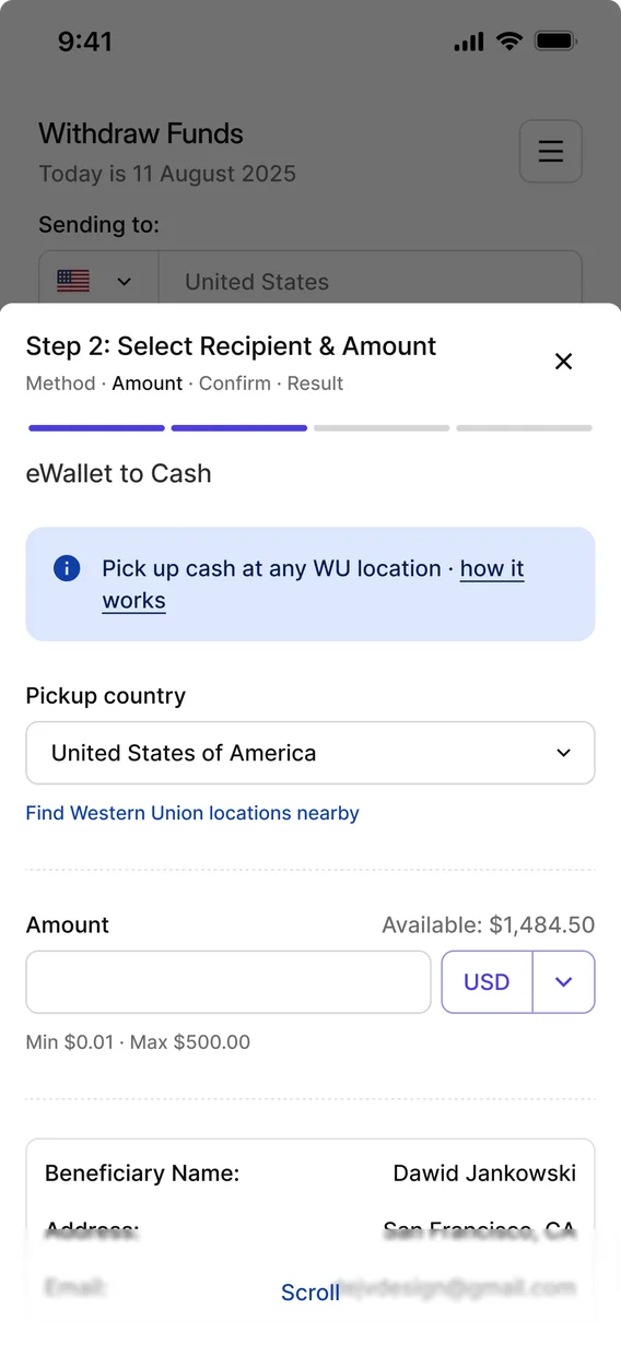
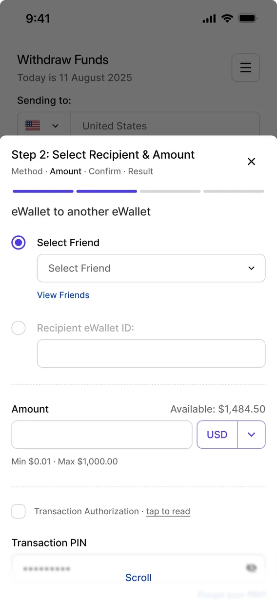
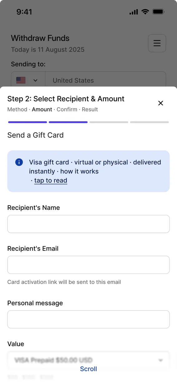
One column, same order
On mobile, everything collapses into a single scrollable column instead of desktop's two-up grid, which keeps the scan order strictly top-to-bottom — there's no side-to-side comparison to slow a thumb down. The hierarchy itself doesn't change: Saved still comes first, then the last-used shortcut, then categories, exactly like desktop. Because that order holds on a smaller screen, the structure didn't have to be reinvented for mobile — it simply stacks.

The button moved on purpose
The most telling adaptation is where the add-method button lives. On desktop it's a small button next to Search, at the very top — useful if you notice it before you start scrolling. On mobile it becomes a full-width "Add new method" button placed right after the Saved list, so it appears exactly when a user needs it: right after confirming their method isn't already saved, not several screens of scrolling later. It isn't a shrunken desktop button; it's repositioned to match how someone actually moves through a phone screen.
Mobile
all methods
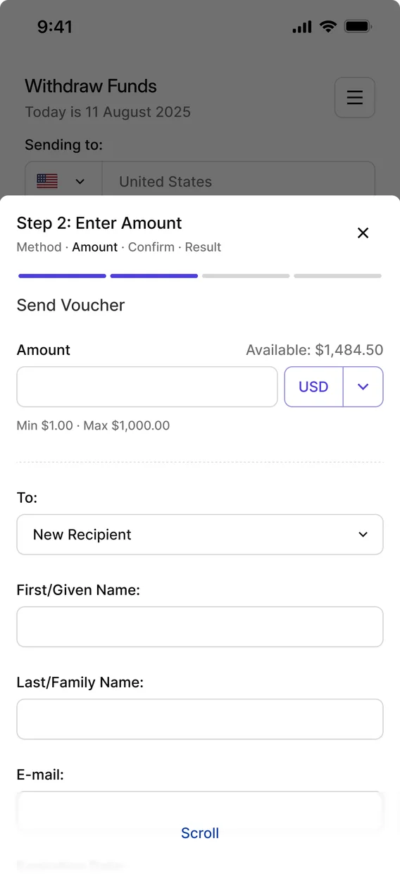
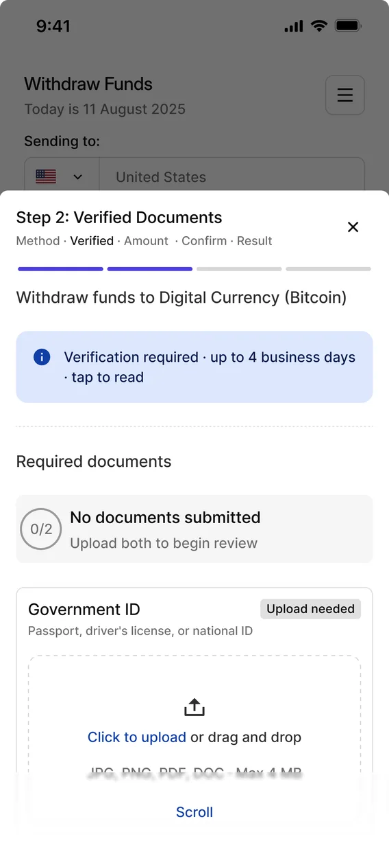
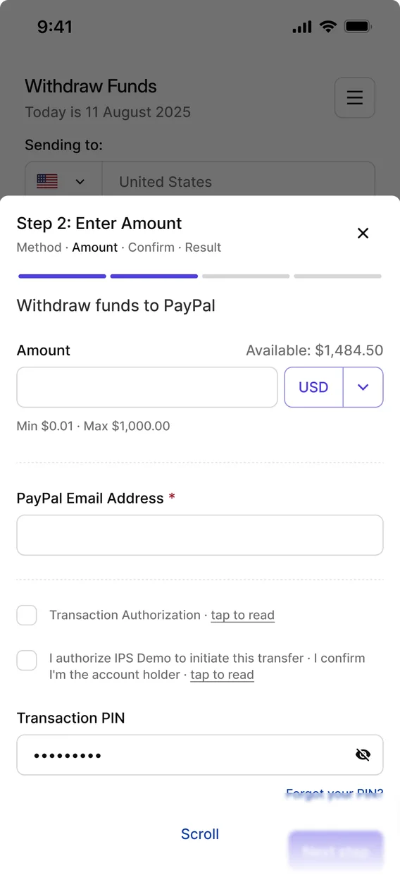
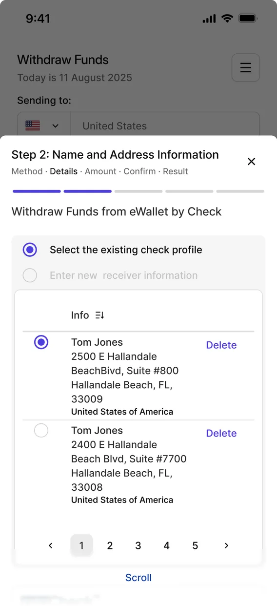
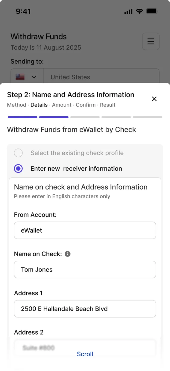
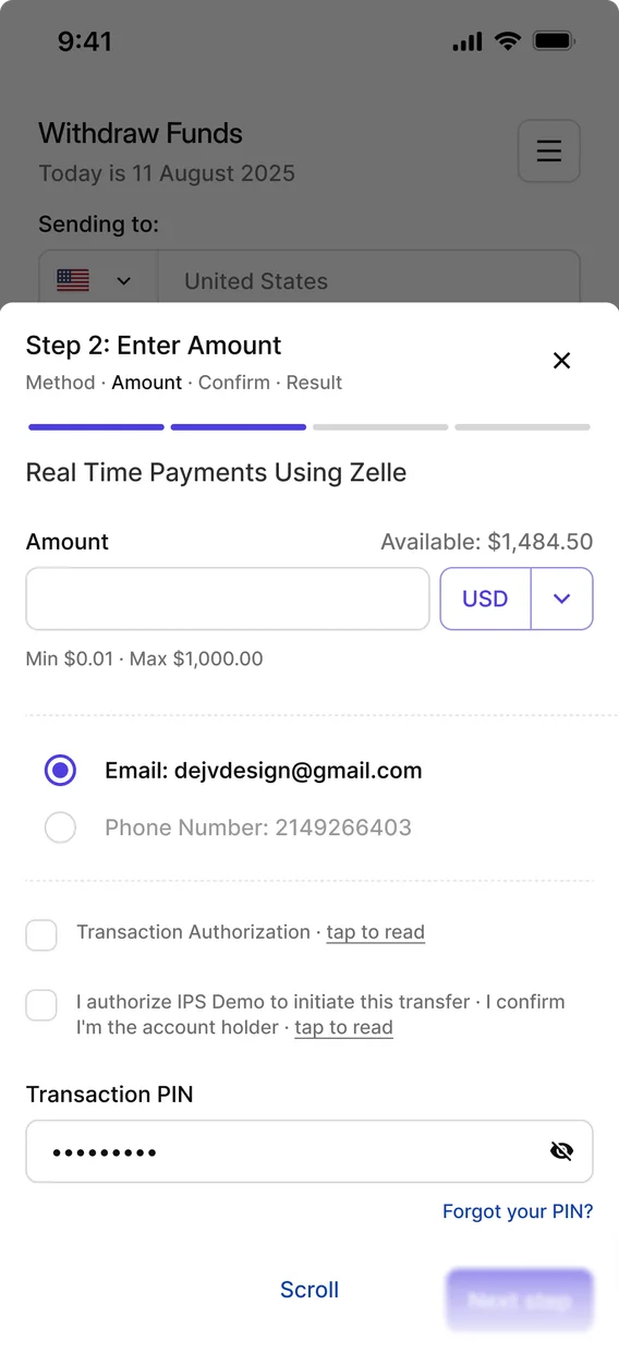
Bitcoin
eWallet
My role
and impact
Owned end to end
Solo designer: audit of the live product, problem discovery, flow mapping, responsive desktop and mobile, developer handoff.
Mapped the undocumented
Mapped every screen, decision and popup of the withdrawal flow, since no documentation existed.
Support feedback into requirements
Turned Support team feedback into concrete design requirements.
One reusable pattern
Built one pattern (step indicator, close button, irreversible-action warning) that works the same across every method and the nested Add bank or card flow.
JMA Attachments